As you may have read, there are some delays with getting the Dwarf into production
This gives us a window where we can test the design of the laser engraved markings on the Dwarf
If you have time and would like to contribute to the design of the Dwarf you can follow this link to the survey
Please be honest and give your first impression. There are no right or wrong answers, only your interpretation
Also try not to give spoilers in the thread so as not to influence other user’s responses
First I want to give a huge thanks from the team. We received over 100 responses to the survey which was more than we expected. It’s great to see how engaged the community is and we have found a lot of value in the feedback you have given!
We have closed responses to the survey now so you can feel free to discuss in this thread without affecting the results. We have a lot of data to read
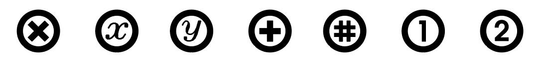
So the circle with an X seemed to confuse a lot of people which we kind of anticipated but we weren’t sure what would work better
Basically it indicates that it is an assignable footswitch. Kind of like a variable x.
It’s in a circle to group it visually with the circular knob icon which represents control mode.
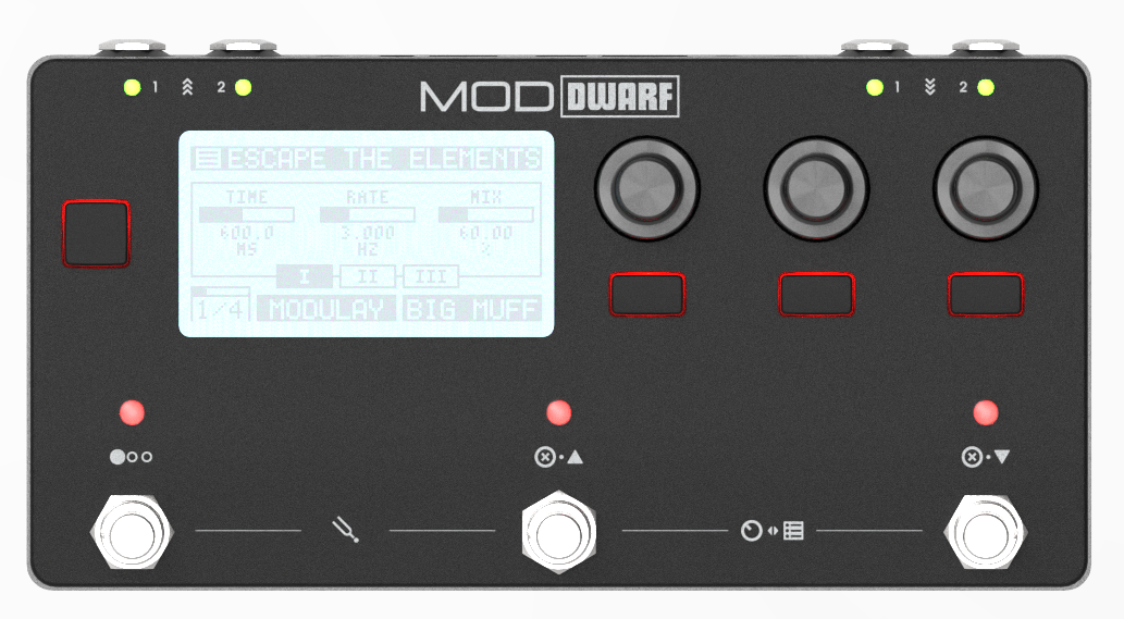
So in control mode, from left to right you have [page selector] [assignable footswitch 1] [assignable footswitch 2]
It is common for pedalboard controllers to just number the assignable buttons which we considered.
We could just label them 1 and 2 but we found a potential issue with that
We are considering adding an optional mode which would disable the pages functionality you would instead have 3 assignable footswitches. This would make it a bit weird because you would have the 2nd and 3rd footswitches labeled 1 and 2
We may add other functionalities in the future where numbered buttons could make it more confusing
Interested to hear what you guys think after knowing the function
We really like the idea of using ISO standards but I’m not to sure if this one is widely recognised. Says that the main feild of application is “Agricultural equipment”
I do understand them being in the wild might cause issues especially if changes are planned. But if you could I would find it really helpful to think about it in the context of the whole device!
Would another option be not to mark the assignable nature of it on the case?
Then you would just assign the Up or Down in any UI. Which would be consistent with other assignable elements, such as the buttons and knobs?
Tradeoff being you have to remember you’ve assigned something to something, but I guess that would be the case unless displayed on the screen regardless.
The ‘x’ and ‘y’ are also my preference of these options, esp. if there are indeed two of them (don’t remember if that was the case). The ‘x’ that was used seemed to indicate that the button could be used to close something (like programs on a pc), ‘1’ and ‘2’ can refer to the inputs or outputs, which could also be confusing.
Another option would be to use ‘a’, ‘b’, which might be a more future-proof approach (for future devices with more programmable knobs).
I don’t remember what I put in the survey but here are my thoughts on 2 things:
Input and Output on the top of face. Why not use the words “IN” and “OUT” the same as in the back instead of the triple arrows up and down.
Any stomps that has 2 possible functions, have the icon in white for the primary function and in light blue for a secondary function. As an example, the center and right stomps would have the circles in white and the arrows in light blue.
Aside from using colors, the circled “X” can simply be changed to a filled circle (a white dot).
i’m enjoying all this discussion. …i did fill out the survey, and it makes sense to try to come up with logical and obvious design choices. however, there’s a limit to how universally obvious these sorts of things can be – people all have different life experiences, which leads to different assumptions!
to be slightly tongue-in-cheek, we could just make the symbols frogs and bunnies and snowflakes - or no labels at all! - because everyone is going to have to read the manual anyways, and just get to know all the functions well enough that reading the face of the Dwarf is no longer important.
i’d be really attracted, visually, to a piece of equipment with no labels! i frequently put artists tape over printed labels anyways, and use my own rather cryptic, graphical labels which are more instinctive during performance.
Hi, unfortunately I saw the survey myself too late and could not participate. Therefore I don’t know exactly what was shown and asked there. Nevertheless I would like to share my thoughts about the button icons with you (I am a UI designer with about 25 years of professional experience).
First to the X-Icons. Unfortunately, these are not understandable in this form and also not conform to expectations. The x and especially the x in the circle or square is actually used at least since Windows 95 to close a window. Many users are likely to understand this conotation here as well. The double x (x on both buttons) confuses there all the more, because one cannot conclude without further information on their actual function. In the worst case you could even understand it to mean that pressing both buttons at the same time deletes the current preset.
The meaning of the icon of the left button, however, is easy to understand. It is the left one of three buttons. Why this language is not repeated on the other two buttons is not clear to the user. One would assume that the left button does something completely different than the other two buttons. So if you plan a mode in which the three buttons can be used freely, you might ask yourself why the left button eventualy can’t do this because the symbol is different (even if it can).
Why not apply the symbol language of the left button to the other two buttons? So always three dots and fill in the middle dot for the middle button and the right dot for the right button?
But apart from the nice look, this would only make sense if you use these symbols in the user interface and, for example, repeat them in the menu where the functions are assigned to the buttons. Otherwise the icons wouldn’t really be necessary, as this would result from the account text by itself. The buttons above have also no caption.
For icon double assignment of the two buttons on the right. I wouldn’t separate them with a dot, because that might imply that two buttons or actions have to be executed at the same time. Separate rather with a pipe (|) or a slash (/). This is much more often translated by the symbol language with an “or”.
I hope that I could help a little bit.
I would say one thing is the footswitch name and another the function it has, and probably it is less confusing not to mix it, considering it is customizable, which I’m sure it will be…
So for me the names could be 1,2,3 or A, B, C and by default switch 1 function will be page selector. Perhaps the name could be on the botton of the switch and the default function on the top… but could be too much info, I also like the idea of a black box…je je
To only show the default function it also makes sense to me, but then I would say better to represent the assignable footswitch with the same symbol like x or +, or even a dot inside a circle.

 …i did fill out the survey, and it makes sense to try to come up with logical and obvious design choices. however, there’s a limit to how universally obvious these sorts of things can be – people all have different life experiences, which leads to different assumptions!