A knowledgeable web developer could prototype an alternative interface that could be usable for technical users. “All you need to do” is have an HTML page that contains some script to open the same web socket and make the same API calls as the current interface does. You get back lists of plugins, their parameter values, and their connections and you can render into whatever layout or representation you’d like. *
I’d be a user and a technical supporter if someone started one.
I know there has been some development recently to better support MIDI I/O and for plugins to communicate back to the user interface when MIDI changes happen. This should make things like TouchOSC or open stage control more practical for use? (that’s an image search because I couldn’t find a single image of an example interface on their current site )
* There might be some technical limitation that I’m not aware of like a device authentication or transport validation to verify the client. I’d guess if you ask you nicely, Filipe will find the workaround for you.
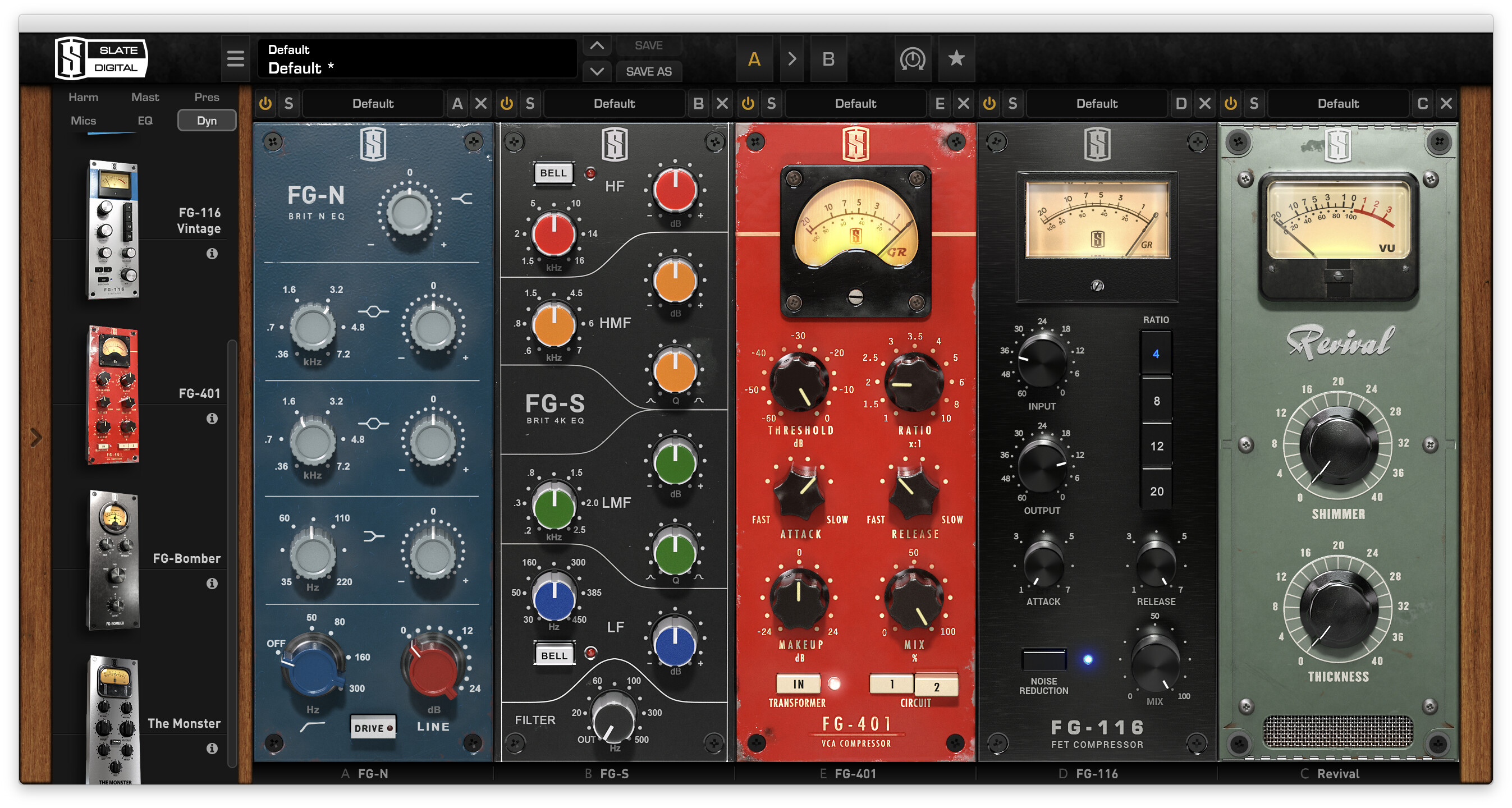
To be clear Plutek I am in no way whatsoever suggesting that all plugins go to a uniform appearance…not at all! Again, I’d just draw the comparison to how, for example, plugin developers like Slate of Waves build their interfaces: they are FAR from uniform and still have lots of visual “pizzazz”. But nonetheless, the overriding directive is making an interface that directly serves what that wffects parameters are, and what is the simplest, most direct, and most intuitive way to manipulate them.
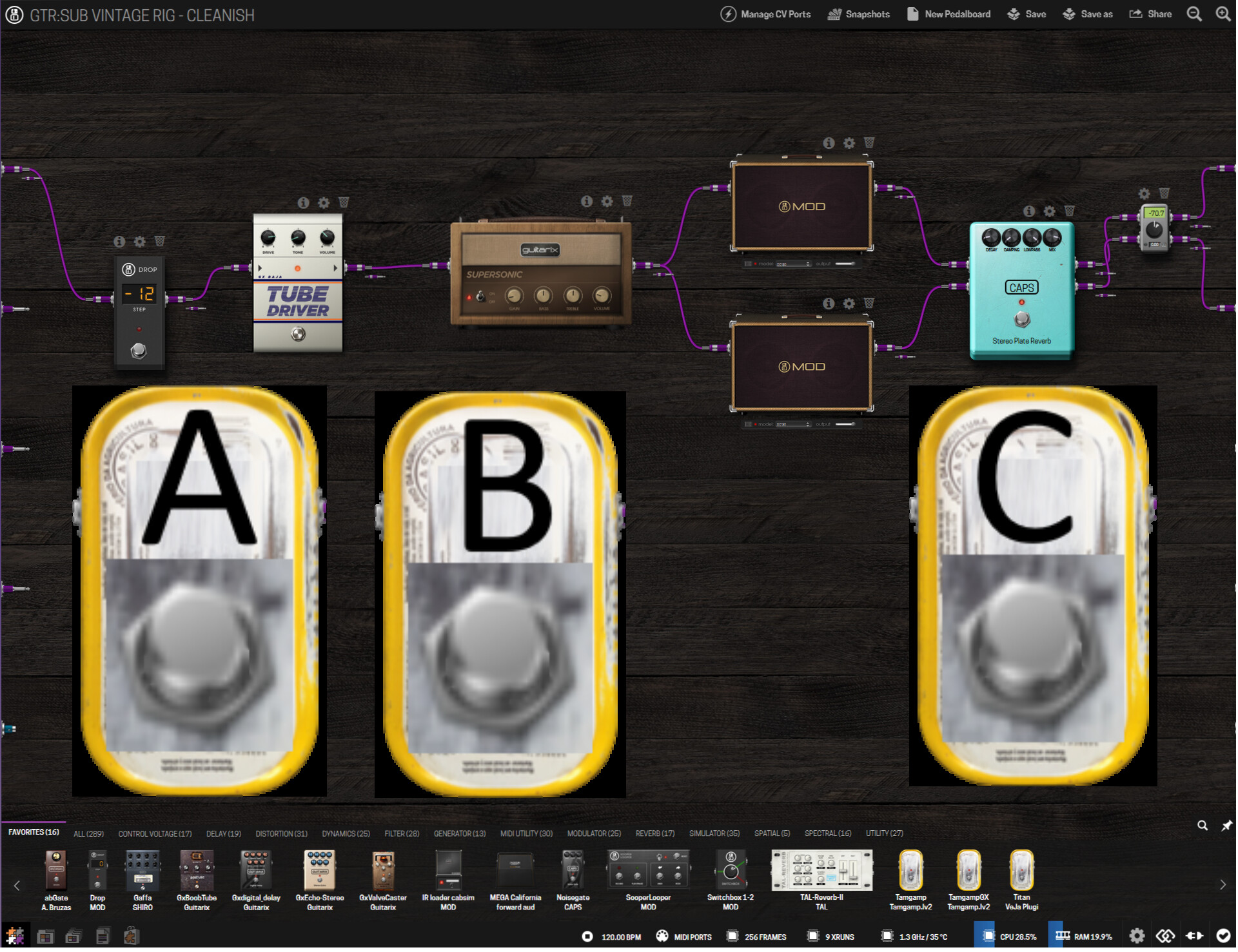
Compare that to any number of MOD reverb plugins where literally 3/4 of your on-screen gui is a f$&ing faux “foot pedal” that serves absolutely no purpose, and then all the genuinely relevant controls are jammed into this tiny top space and laud out on dumb “knobs” that you have to struggle with on your mouse. Kinda sad really.
@Greatmagnet and @Tarrasque73, I’m thinking that are two situations (similar, but a little different):
The first is when you’re using a touch device (like a tablet). In this case, it’s hard to use knobs because they’re a quite imprecise and a fader would be better to controls (@Tarrasque73 case);
The second is when you’re on a PC or other device where you have a physical keyboard, when you can easily insert the value (@plutek case). On touch devices it’s also hard because when an user click in an input, the operational system shows the (virtual) keyboard and resize the window, generally changing (for the worse) the original view.
I think that both are valid. The user being able to select the way that will use would be amazing.
I didn’t found any documentation about how to use they, but apparently it’s no so hard to understand what is meaning the source code. Also, I didn’t check if the communication protocols need authentication.
I will try to prototype some different view latter… (just some images, not coding)
I think that it’s for when an user need specific views to controls specific parameters (just like the mod Dwarf/Duo X knobs, but virtually). Maybe the previous comments are more related to generic pedalboard configuration. But I also think this is valid.
yes indeed. Just think about a “real life” example: Boss pedals.
They all kind of have the same box. Now imagine if they had the same colour and interfaces layout, etc.
I also personally agree with most of the things that you pointed. I even think that this is somehow holding humanity on certain developments - because we always need to find a physical partner to relate to digital things.
Yet, this is more psychological and cultural than anything else. And changing it radically may be a huge mistake.
I can remember while kid to have a sort of book or read somewhere how human inventions come from observation and replicas of nature and the animal world. How scissors and pliers come from the “legs” of crabs, planes are inspired on the way that birds fly, etc. It’s really a human psychologic handicap (and strength in other situations) thing, I believe. We always search for familiar things.
Totally agree! If we look properly, in the digital world that is really what makes more sense! Yet it brings all the “lack of familiarity” and “looks complicated” issues.
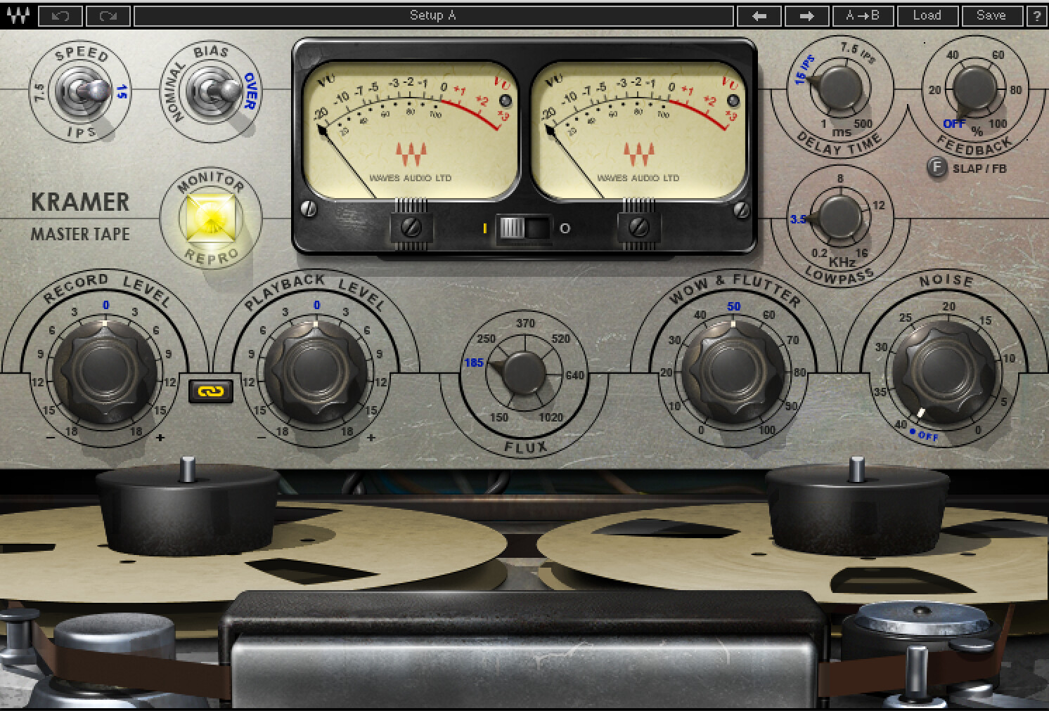
well…here depends a lot on the plugins that we are talking about. Just look to the SSL or CLA plugins from Waves, those are pixel by pixel replicas of physical hardware. Than you have the Kramer Tape, a great plugin, but this goes way too far on the replica as you can see:
Those bobines actually spin around…why? no one knows…I remember trying to use it on a machine that ended up not running it because of the graphics…but I was trying to use it for sound purposes.
But, again…I understand why they do that. It’s the sense of familiarity.
Also related about the UI interfaces: I think that it’s hard to the MOD team rework about it, mainly because they created a pattern and third developers develop the UI in their projects.
But, it’s common in the technology the UX improvement, as instance, Google sometimes updates its Material Design, the guideline with the best UX practices for Android apps.
Maybe, a solution for this case is to do an UX study and develop a Guideline with the best practices. But a UI study will causes more cost.
Also, a complement it’s offers ways to expand the controls: Mod offers a generic way to controls with mod-ui and the knobs and footswitchs (that attempts a most of cases but not all) and offers alternatives for specific cases with control chain and MIDI.
But I miss the documentation of the REST+websocket communication. With it, developers can develop UI/UX alternatives. And also, maybe, the good ideas be officially incorporated.
The problem that I would have with losing the individual look of the plugins that I build boards regularly and use the look of the plugins to find them - I recognise all that I use regularly. It would be awkward, especially if working on a small screen, to have to actually read what a plugin is . . .
I see some User Interface of some apps. Maybe the Amplify Remote is most similar of @Tarrasque73 requested.
On Pedalboard Editor, enable “quick edit” to edit the parameters, just like other headers buttons
In this mode, when a pedalboard is touchable, the “quick edit area” appears on right side: On large devices (like a tablet), the screen is divided in two:
The quick edit area (on right) will presents the parameters as combobox, on-off buttons, and slides (instead of knobs).
In smartphones and other devices with small screen, an alternative is, when selects an plugin, shows the quick edit area in all the screen. To go to back (pedalboard view), press a back button on the screen.
Beside of the parameter, will apper the current value as an input number. A user can clicks it and changes using a keyboard or virtual keyboard on mobile devices (@plutek ideia);
In the header of the “quick edit area” will contains:
the plugin name;
a small plugin image;
a edit button to shows the original parameters area;
The on/off plugin button.
This prototype probably facilitates the management of the parameters. But it didn’t attack the “connection problem” and “plugins replacement”.
Would be also useful to have a “dummy” plugin , a simple footswitch that sends midi signals (maybe with latching and momentary options), large enough to be easily pressed (touched) on a tablet screen.
If you’ve ever used the Poly Effects Beebo, which is a brilliant device, you’ve seen what a modular environment looks like without the skeuomorphic look that the Mod Constructor has. And let me tell you from experience… it gets really difficult to debug a complex module layout after it’s been in place for a while. I have to agree with @shaggydog — in this context the pedal look is helpful.
Since the Constructor environment is a webpage, though, it’s not unreasonable that it couldn’t be themed—maybe that way people who like the skeuomorphism can keep it, and people who want a minimalist box look can choose that. People could possibly design and submit themes just as they can submit plugins.
For that matter, the Beebo allows people to choose whether the signal chain goes right-to-left or left-to-right… if Mod would let people choose which direction that goes, people can stop debating which is more appropriate for a virtual pedalboard…
It’s definitely not too late to change. For a while now we have been talking about some kind of overhaul of the web GUI. It’s really great to get this feedback from you guys because it’s one thing for us to come up with ideas but if it is backed up by user feedback then it is more likely to be given a higher priority!
I also come from a DAW environment (Ableton) so I’m used to seeing simplified graphic design with intuitive and informative UI/UX. Some people really like the skeuomorphic design but I think it’s important to find a balance between
A: A recognisable interface to ease the onboarding of new users (possibly transitioning to digital)
B: An interface that easily conveys a lot of information in an efficient way that is intuitive to interact with
The web GUI has been going through evolution for a long time and is due for a revolution. The problem is that there are A LOT of things to consider and each of these small things has big implications. Some things that I have been thinking about for a while
Higher-resolution plugin GUIs. This would mean either all GUIs would need to be updated or that resolution would be independent of the size on the pedalboard.
Standardised sizing. Meaning there would be a defined sizing specification for plugin GUIs. For example, we could have a set of 3 - 4 GUI sizes 3 - 4 Knob/slider/button sizes with a specified distance between controls for each size. Plugins would all be similar sizes so that you don’t have huge amps or cabs next to tiny pedals. So the scale would not reflect the real world but would mean less zooming in and out
New GUI templates with semi-skeuomorphic designs. For example, since an amp and cabinet would now be a very similar size to a pedal, it would not reflect the real world scales but the aesthetics of the GUI could reflect the real thing. Eg, a cabinet could still have a leather-wrapped border and could show speakers inside. An amp could have 2 rows of knobs instead of 1 to reduce its width while still looking like an amp. The knobs might look much bigger on the Amp compared to the real world to keep the knob size and spacing consistent while reducing the plugin real estate.
Should there be an attempt to standardise aesthetics? to fit a theme or style so that the catalogue looks consistent
Plugin Snapping or Stacking. Most other platforms either stack plugins vertically (like guitar rig) or horizontally (like in Ableton, amplitude, bias etc) which allows them to stack them and route without cables. This is hard for us for a good reason. Our routing options are far more flexible as users can create infinite audio, midi and CV cables to route or loop back to anywhere they want. So stacking would be very complex. Snapping would be very nice and this places importance on standardised GUI sizes. Snapping in this case, instead of being either vertical or horizontal, could be a 2-dimensional grid. However, this raises questions about how to route cables better
Rethinking the Cable routing. There have been some good suggestions about the cables. I personally am not a huge fan of the bezier curve style. I think straight-line cables or locked vertical and horizontal cables as suggested earlier in the thread would look cleaner. I’m also not a huge fan of big jack plugs sticking out the side of plugins and wonder if they are even necessary. Considering the request about the signal flow direction, the complexity of routing options as well as the possibility of plugin snapping, it could be reasonable to have the inputs and outputs be unlinked from a specific side of the device. The jacks could be adaptive to be on whichever side of the plugin is closest to where they are going. The jacks could also just be on top like a rack. A lot of things to consider
A new builder interface. There has been a lot of ideas about plugin categorisation as well as what the interface should look like that you browse and pull the plugins from. Where should it be? it could be on the side instead of the bottom.
Should the plugins be controllable from the assembler? or only from a menu? Should the plugin on the assembler just be a thumbnail and the actual GUI opens when it’s selected? (like in a DAW)
Should GUI designs have a specified viewing angle? Eg. Make everything orthographic as if you were looking straight at the device so there is no weird angle on the knobs of a pedal which is inconsistent with the lack of angle on the knobs of an Amp.
Knobs in our interface already work like sliders. Once you click it down, you simply move the mouse left or down to turn it down and right or up to turn it up. They don’t need to be turned
We are already working on a container system which would do something similar
+1 to this!
+1 to this as well as duplicating plugins with the same settings and being able to undo deleting a plugin so you don’t have to bring it back in and redo the routing and settings
I agree with this. I think there a lot of good examples of this. Like this for example Klevgrand - Korvpressor
I like this idea. I don’t think it has to be sliders particularly given that the knobs act like sliders but take up less space. I just like the idea for the parameters opening on the side instead of as a full screen pop up
I would even say we could have something like this built in to the GUI that would 1:1 reflect the controls of the device. Like a macros bar at the bottom that could be hidden or shown. It could even be used for assignments with a “learn” feature.
I agree too. I think we can have unique looking GUIs that don’t need to 100% reflect the real-world equivalent.
I think this could be pretty cool but would require a lot of work and I think it could be avoided with some standardisation of sizing and aesthetics
See my comment above about cable routing. I do think it could be cool if there was no defined direction (2D anywhere goes) or if it could be reversed. But I fear that it could make it more confusing to understand the signal flow especially when using someone else’s pedal board from the feed
Although I mapped it, I personally don’t really get this one.
I feel that this would kind of “deny” big part of the nice things about the MOD platform. The WebGUI is a “window” to create the pedalboards that run inside the device. If we use all the type the WebGUI to “play” what would be the advantage to a software?
This one I agree. I think it would be the best solution. But it requires time to implement.
Just throwing my 2ct into this very interesting discussion.
I think there should be two significantly different user interfaces in the web GUI in order to adress different audiences and use cases. Just patching on a few things here and there, will likely just overload an already complex UI. Before you say “nah, duplicate code”, think about your own computers… the command line is only a few key strokes away and has completely different approaches and advantages. I like the current interface very much but a clean slate would allow us and the MOD team to rethink the work flows people have developed over time. Plus: without annoying the existing user base.
Of course, the whole effort would only be useful if it offered significant benefits to the current UI. Small-screen devices like smart phones come to mind.
It’s just a way to use a tablet as “handswitch”. A shortcut for snapshot selection or changing a parameter with 1 tap. Each plugin could send also chained midi signals on different channels. Configuration features should mimic those of midi baby 3 by disaster area designs.
I like the idea of the bottom/side/top bar. With the same concept, hidden bars could contain snapshot selection and parameters like great SrMouraSilva mockup. Modal dialogs as per now are not so useful in live situation. GUI elements should be touchscreen friendly. Market is going in that direction (Headrush, Quad Cortex) and the idea of having also two separate layouts is intriguing: A) current layout management for studio sessions (with large screens and mouse usage) and B) simplified layout for live performance with large UI elements for small screen and touch only input.
The two UIs should just differ enough to optimise different use cases and work flows. Just changing the appearance of the pedals is in my opinion not worth it. I am still surprised how creatively the platform is used and what the pain points of the different user groups are. I perceive that most guitar players are quite happy with the flexibility upgrade they get but the synth enthusiasts seem to have much more need for automation and creating sounds on the platform.
Thing is: I don’t even know whether the groups I just envisioned are a good representation of your user base. It is just my perception. Also, I remember some ancient threads here about designing a mobile user interface… the skeuomorphic look does not cater to that idea, neither.
 MOD UI improvements for creating connections - #3 by unbracketed
 )
)