I thought you would like this
Let me spend a bit of time this morning to make a diagram to illustrate the desired direction from my perspective
I thought you would like this
Let me spend a bit of time this morning to make a diagram to illustrate the desired direction from my perspective
Did you model it in Blender?
No it was modelled in parametrically in CAD and then rendered in another 3D rendering software. I would like to move to blender in the future though so that we can share files with the community
Did you use PBR-settings for the material or multi-chanel-maps with normal-maps etc.?
The latter. In this case the graphic on the top is an image which is adding the diffuse map for the black colour as well as a displacement map so that it is slightly raised as if it’s an extra layer of paint that has some thickness
Recomendation from my side: Use the PBR settings. These are much more powerfull and even more realistic, especially for dirt and scratches. The settings are for metalness, refelction, ambient occlusion etc. Or use the substance painter.
This is an example, just taken from internet:
Sorry that’s not entirely true what I said. The material is PBR but it also has multichannel maps. The 2 aren’t mutually exclusive. So you have an “advanced” PBR material with channels for diffuse, specular, roughness, bump, opacity and displacement
Here’s a bit of a guideline as to what I believe would be a good direction to go down. Nothing is official yet, this is still a discussion and we are learning together as we go.
I know that this goes against our current SDK. I think we need to update the SDK and create new asset packages but that is a big project that we can’t take on right now. So I would encourage you guys to keep making your own stuff and avoid the SDK if you have the time to make everything custom
Consider this a nudge in direction
With the “semi-skeumorphic” designs I put on there, I probably went a bit too far with the vertical squeeze  it doesn’t have to be that extreme
beautifully clear guide, @James! i like the two-direction approach.
…had to look up “uncanny valley”; the concept is an interesting commentary on a number of trends in both product design and cultural content.
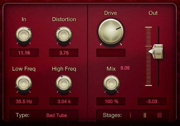
Well, I must admit that I mostly like the old style (MOD DS 1) from all forms you provide here which you mark as no go. The Dine Comp you provide as nice has a big issue at the corners from the pedal. Only acceptable format other than that will be the one for the Compressor. But, that one could be done better.
I’m glad to see this topic didn’t die. Despite some of my previous communication, I’m wishing the MOD platform well and really hope it succeeds.
@James What you posted above looks very cool, some of the @Kim’s designs were pretty cool as well, but it seems to me (based not on my own preferences - since I’m not a MOD user anymore - but on some of the most recent comments) that the barrier to entry is simply too high for most users when it comes to creating graphics using 3d tools. I’d probably need dozens if not hundreds of hours of training to try to create something similar (even then, I doubt I could), but I could probably make a few of the “semi-skeuomorphic” stompboxes (the examples of which you posted above) in one evening with a cup of coffee. And I’m not a graphic designer.
Everyone has different preferences, and beautiful UI can certainly inspire creativity, but at the end of the day it’s about the sound coming out of the box, and the more time we spend with a piece of gear/software, the more important efficiency becomes. I’ve already posted examples of what modern multi-fx units usually look like, and shared my views on the importance of readable UI/market trends. Let me supplement that with an anecdote. I’ve recently tested Tone King and Benson plugins from NeuralDSP and Mixvave respectively. The first hour with both of them was great. They look just like “the real thing” and the fact that they sound great doesn’t hurt matters either. That being said, despite liking both pieces of software, I declined to purchase either of them, partially because the UI in my HX Edit is so much faster and easier to work with.
@James I don’t know if a system-wide UI overhaul is something that you’re planning to do and how important that even is to the platform as a whole. It’s not like the current MOD UI is terrible - it certainly isn’t. I’m sure it even attracted many of the current users. What I do believe though, is that MOD should likely aim to make it as easy as possible for the community devs to create quality software for the platform. LV2 is already niche, LV2 plugins ported to MOD will always be an even smaller subset of an already small plugin pool. I suspect that a realistic/skeuomorphic approach to UI is a barrier to entry, (which some of the above comments seem to echo) and I’d imagine that the fewer of those barriers are there, the better it will be for the platform.
Again, I’m not a MOD user anymore, and I’ve been a bit of a dick in the past at times (sorry about that) so this is just meant as an observation and not a ruling “on how things should be done”. I’m making it mostly because users voiced similar views above, but those voices were not quite as loud as some of the others, despite having a lot of merit to them.
EDIT:
One more thing. Ableton became extremely popular among musicians in recent years. It’s not my main DAW but I got the 16-track license for it anyway, just because of how fast you can create an idea inside of it when compared to other DAWs. My immediate thought when I saw this semi-skeuomorphic square stompbox with light bars, that’s right next to the Ableton compressor in the image posted above, was: “this feels right”. Just a thought.
What is it about this one that you like more?
Can you elaborate on what the problem in the corners is?
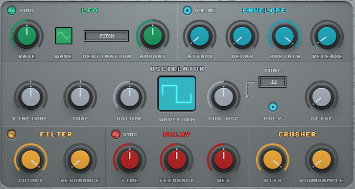
I completely agree, which is why I have been putting so much emphasis on vector based designs. They are much faster and easier to make with free software that doesn’t take too long to learn. Plus we can easily share working files. There are a lot of people willing to contribute but so far we have only seen one person here try something with a 3D model. Its a good indicator that vector base / flat designs will make things easier for devs. Flat designs are also very easy to use which is why after decades of research in UI/UX design, the vast majority of modern DAWs and Plugins use this style as you said
As for the 3D route, the aim would be to create assets and implement them into the SDK so a user can simply choose the enclosure, the colour, the knobs, controls, titles and upload images that would be a kind of colour layer, so the highlights and shadows of the render are automatically applied to it without ever having to touch the 3D software. This, of course, will need some time
It’s been on the cards for a while very important!
You are completely right. We have a lot of work to do still on that front
I get that feeling a bit too. This discussion has been going of a lot of assumptions until now which I think is okay because we are just spitballing ideas. I think that soon we should start to do some polling/surveying of users to find out what they value most in the plugin GUI designs
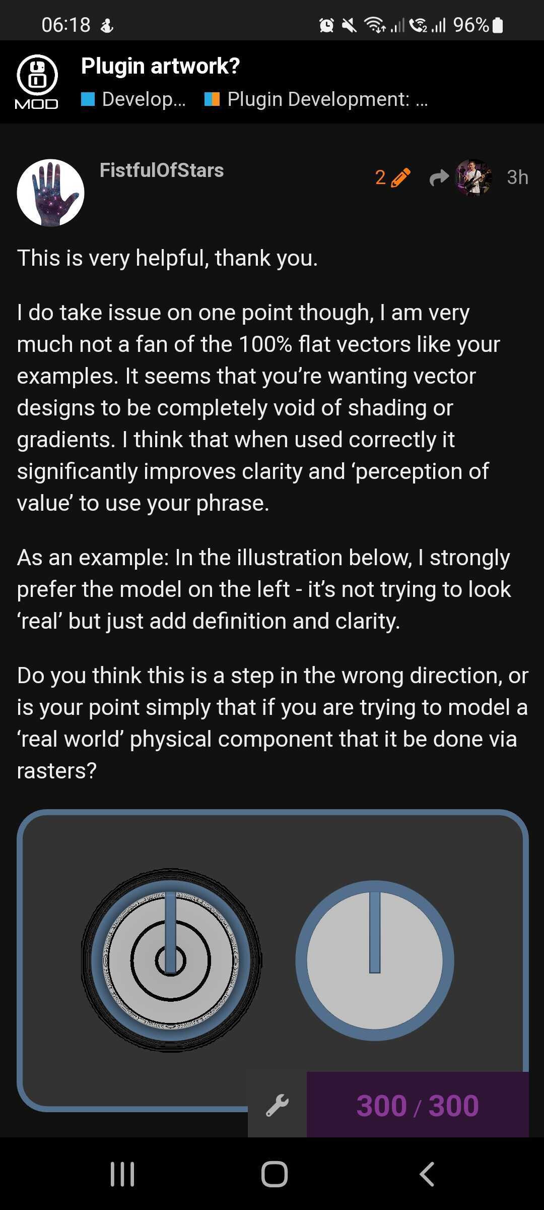
This is very helpful, thank you.
I do take issue on one point though, I am very much not a fan of the 100% flat vectors like your examples. It seems that you’re wanting vector designs to be completely void of shading or gradients. I think that when used correctly it significantly improves clarity and ‘perception of value’ to use your phrase.
As an example: In the illustration below, I strongly prefer the model on the left - it’s not trying to look ‘real’ but just add definition and clarity.
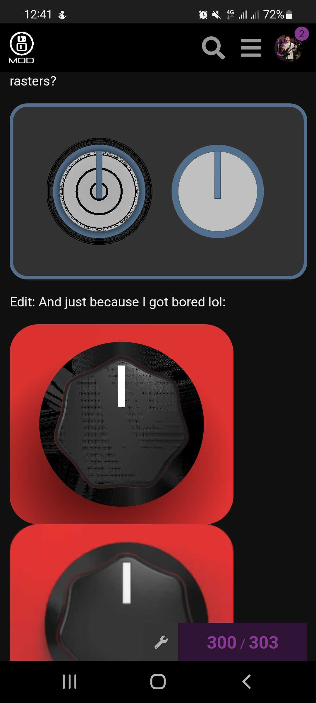
Do you think this is a step in the wrong direction, or is your point simply that if you are trying to model a ‘real world’ physical component that it be done via rasters?

Edit: And just because I got bored lol:

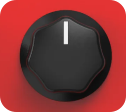
To be clear, there’s no good reason to try to emulate this style knob via vector graphics. I was just having fun.
I mean the left side of the pedal, the corner looks damaged to me.
I like the texture and the rounded corners.
You’re right in some cases but it’s a slippery slope I think. It’s very easy for it to fall into the uncanny valley if you’re not careful. That’s why I did more of a “caution” sign rather than a tick or a cross because it can go either way. If it’s done in a subtle consistent way without too much detail I think it works. Here are some examples of where I think it works
No, I think this is pretty safe. I personally would remove the thin border around the indicator line. I don’t think that amount of detail is needed. This is a pretty clean design though. I will just point out that it looks quite strange on my phone
Woah! the one on the left is a vector graphic? if so I’m very impressed. How did you do the highlights and shading with such specific shapes? I can see a value in making elements like this
Do you mean on the very edge where it’s pixelated? it might just be the way I cut it out on photoshop. Or do you mean the geometry or lighting on the curve of the corner?
I can understand that subjectively you have a preference but in terms of realism we can objectively say that it is less realistic as the textures and lighting are not PBR and the corner geometry does not match the real world device
That’s concerning. I don’t see that on my phone. Granted, that export was done quickly without any optimization or QC, but it’s a stark reminder that SVG is subject to different browsers interpretation for rendering.
What phone/browser combo are you using?
It’s kind of ridiculous honestly - 12+ layers of gradients with varying opacity and blend modes. This particular example was rushed, and would not look right when animated - but if I took more time that could be corrected.
It’s not as bad on the second knob you made
That’s impressive! Hmm something I found with SVGs is that browsers don’t support all types of gradients and blend modes that are available in the software. Linear gradients and circular gradients work fine but path driven gradients don’t seem to work
Those really look terrible.
I’ve tested on my PC with Firefox and chromium, and on my Motorola with chrome and brave, and they all look like they should.
No path gradients have been used.
It’s quite concerning that rendering can be that different.
Is anyone else seeing these types of rendering errors?
Nobelprize material.
I love where this thread is going.