Many thanks, James! Yes, some rearrangements are still necessary. I also want to tweak the frog a bit so that each finger gets a knob in a bit more sorted manner. Let me try…
3 Likes
Where did you get the frog image from? is it royalty free and free to distribute?
1 Like
Since the frog design is being iterated already, I’ll shelve my more conventional amp design.
You mentioned you could use designs for some other plugins as well? File recorders, the fuzz etc.
Let me know which one I should try first.
@ the others
Following up on my original post; are there other plugins that would benefit from a make-over?
3 Likes
@James
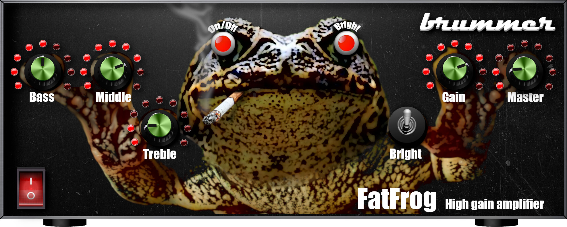
You are asking the question too early, it is still only a design proposal and the frog is not yet ideal (he must look straight forward). I am waiting for brummer to say which design he wants. When brummer has decided on a design, I will finish it and then, of course, only permitted material will be used. But this one is permitted for personal use already.
1 Like
@brummer
Here is the final design for the second design proposal (@James completely royalty free  ). Now all parts are in a system, well sorted and alligned.
Please tell me if this is fine for you, then I will finish all parts.
I can take out the cigarette again, if this is too foolish (I like it, to be honest).
8 Likes
If it’s a fat frog should it have food in its mouth? 
3 Likes
I dig both designs! Very different from the rest. Cigarette is not my thing, tbh. Even frogs shouln’t do it… it can reduce their sperm count thus have a negative impact on their procreation. 
5 Likes
I like the second as well more.
It feels more direct…“in your face”
Yes, but if it lights up more and more according to the amount of gain it will be super cool haha
1 Like
I’ll give my probably unpopular opinion: this is exactrly the kind of design I would never want in the Mod interfaces.
All eye candy, for no usability advantage, if not detrimental to it (imagine trying to spot the lighted up leds is a small factor monitor or poor viewing condition).
I keep guessing when will we realize that the Web GUI is just that: a Web based interface and it should be designed following the tenets that every good modern Web based interface should follow. Ease of use, clear visuals, real estate rationalization and consistent design? The plugin representation in the UI are NOT real, psysical devices. Why do we keep design them as such?
1 Like
@Tarrasque73 …because life can be funny sometimes and not only rational. You don’t have to add the plug-in to your pedalboards if you don’t like it. Just ignore it…
3 Likes
Problem is that the plugin sounds REALLY good, so that I’m already using it.
4 Likes
…then you will probably have to live with the design created by the one who implemented the PlugIn…
1 Like
Of course the plugin developer is absolutely free to do whatever he he wishes, but since we are all writing in a public forum I’m just stating my opinion like anyone else.
3 Likes
I would also forego the cigarette. Maybe the frog could get fatter with more gain haha
5 Likes
I agree to some extent. I think the frog doesn’t have to be linked to the LEDs or the knobs. I like the idea of having a frog on the GUI that gets fat as the gain is increased (like the sausage fattener) but it could be seperate from with the controls are so they are easily readable
…very good idea, the frog getting fater by gain… 
2 Likes
That’s an interesting discussion. The GUI has been designed to be a proxy to what what musicians know; like where to expect buttons on a pedal or an amp. UX is strongly tied to ‘what does the user expect’. where to find something, how something will behave etc.
That’s why I tried to follow the trend MOD had set but also what users know of operating an amp.
This one was a mockup but it follows the design pattern of an amp, known by a large portion of the target audience. While I added a subtle amount of “character”, the readability is still good and everything is placed where it makes sense. It doesn’t look to ‘loud’ on your board as well, as you want to maintain an interface that doesn’t wear you down mentally. It’s still a bit boring as a concept but I was only going to improve texture and “feel”, while the ocntrol layout in Brummer’s initial release was perfect already.
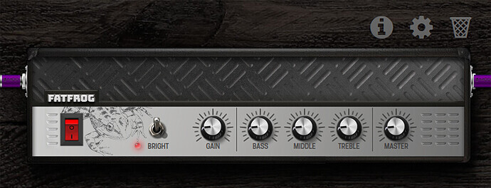
I could try pouring it in a “lunchbox amp” casing, that is easier to handle than a the long amp design. But still, everything would be where you expect it to be.
@Kim with all due respect, I find your design funny and creative but it doesn’t score well on my “UX” meter. That’s not because Brummer prefers your designs over mine though | My eyes just need to work and scan a lot to find where everything is before I could click it. The green knobs and their reflection are somewhat harder to read and I was never a fan of the leds around knobs since that is redundant and mostly used when the kbos are “endless” and have no marker.
4 Likes
I acknowledge and understand the rationale behind the reasoning according to which VST and digital plugin have traditionally been graphically modeled on the actual counterparts from the analog era.
While I’m old enough that I started to play with foot pedals and I still own my good old Mesa amp, my personal thought is that we should consider moving on from that, leave the training wheels behind, and start thinking of PC/Web audio UIX as something native to that, which could leverage the differences of a mouse+click or even touch human interface to the maximom, instead of simulating knobs and switches.
But that’s my own stance. The Mod plugin interfaces at the moment do not follow my view, fine enough. The design you posted is, though, a fine example of what under this style is a good design. It’s simple, intuitive, readable, logic, and has reasonable wasted space for eye candy.
Think again of the device you’re modeling: a real preamp. Why are the controls all lined from signal input to signal output? Because it works. Boring, you say? I say functional. That’s why most preamps look almost the same. A tried and true pattern makes a standard that makes people able to work faster and better IMHO.
3 Likes