didnt ohm force have different skins for their plugins?
 Sorry to see you leave the discussion. Thanks for the frog design though… it was a novelty that made me chuckle!
2 Likes
These are some nice illustrations man! You could definitely put these into illustrator or inkscape to make some really nice, clean and colourful vector art
like this one
and this one
and this one 
there’s a really easy way to do this in illustrator with the “live trace” feature
1 Like
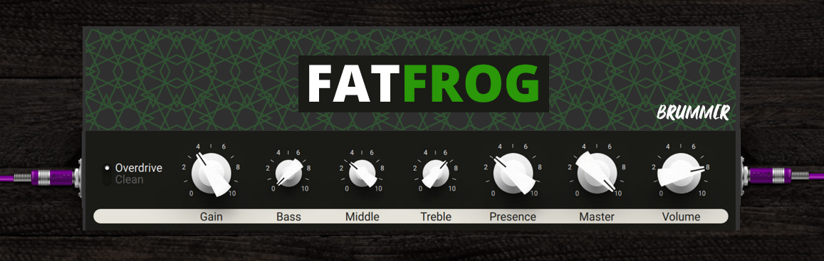
To bad. I guess it wouldn’t help if I tell you how many attempts I’d made to create a UI for the FatFrog, without ever been really happy with it.
3 Likes
Why bad? The target is achieved!  You now have one (unfortunately not more, the reach of the Forum probably wasn’t enough) that will give you good design for your plugins. First and foremost, the goal was to prevent this from happening (sorry Lieven, I know, I am again too hard…):
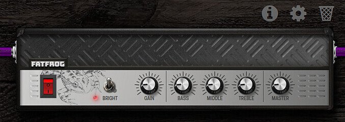
This is a steel-amp and not a fat frog… We need to come up with better ideas that are also conceptually well thought out. And Lieven can do this.
1 Like
@LievenDV this is just a quick example using your drawing of how it can be turned into vector art in Illustrator using live trace with some little cleanup. It’s best if the source image has very high contrast so like drawing with a dark black pen on very white paper so the edges are clean when converting to vectors
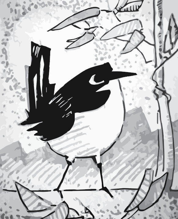
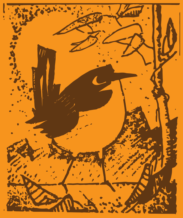
These vector images could also be used as maps in a 3D rendering software. For example, in the images I made of the Laser engravings on the Dwarf, I could instead use a vector image of this bird which would then look like it is engraved and indented into the material
2 Likes
Nope. The target of this thread isn’t “create a UI for the FatFrog” but “Plugin Artwork”. Thus means, there are a couple of plugs, idle in the beta store, waiting for a UI. Not only some of mine.
And you’ve proven already interest and skill to help us out on that. It would be a pity if you throw the towel just because I prefer a more metallic interface for the FatFrog.
6 Likes
Hey Hey
7 Likes
I have that Julianna pedal. Used to trade gear with an employee there.
A lot of my pedals have artwork on them, and my synths are even busier on the aesthetic side of things.
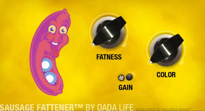
I actually like the frog design, and how the eyes and fingers are controls.
I’d ditch the cigarette, we smoke meth around my parts.
Just kidding, don’t let that frog do a poor man’s drug.
Also a joke.
I personally like seeing pedals with flair, 90% of the time I’m looking at the detailed parameter menu, so the graphic really only applies to the gui pedal board, and no one but me ever sees that.
However this resolves, it’s awesome to see you guys working on helping out!
5 Likes
If I open his beak and make him scream while he squints his eyes, we’re nearly there
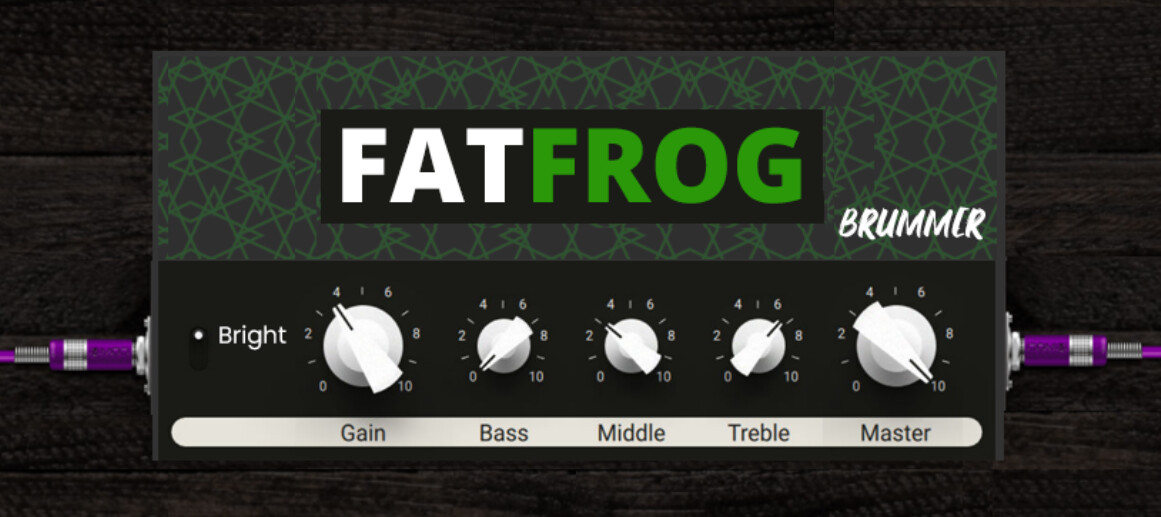
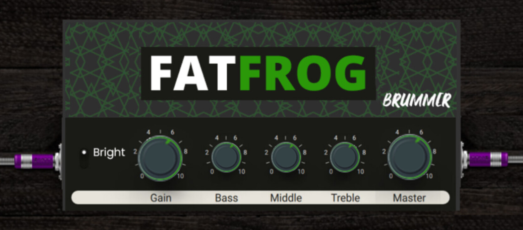
Yeah it’s a bit bland now.
Yeah, been thinking about that plate and replacing it with a grill (with openings for air) and a frog shape worked into that or something
Interesting, I should try develop “simplified” high contrast art and get it “vectorized” that way.
Would that technique work for lineart too?
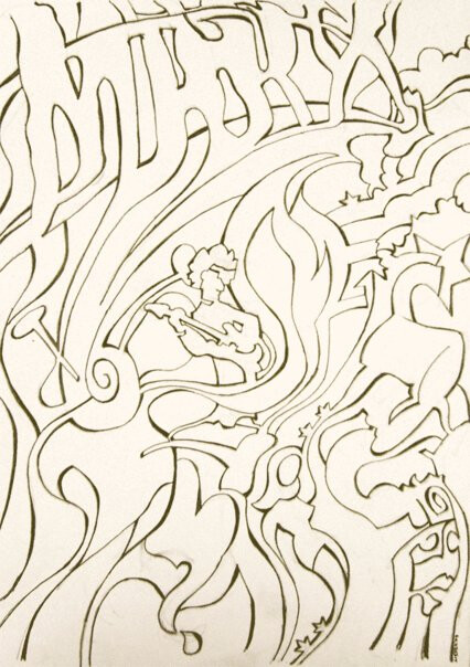
This is a hommage to Hendrix, incorporated themes like ‘voodoo child’,‘hey joe’,‘little wing’,‘electric ladyland’, ‘wind cries mary’, ‘fire’ and “bleeding heart”
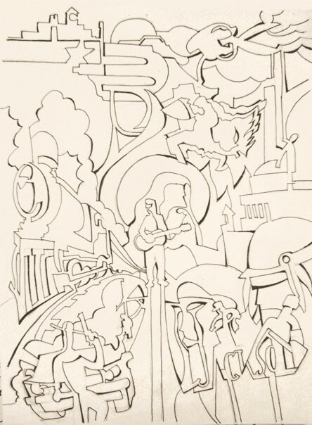
And this one is for Johnny Cash fans
3 Likes
hey hey indeed!

I like where this is going
Absolutely! once again, very nice work 
2 Likes
@Kim please don’t let this keep you from posting this kind of stuff. I think there is at the least a great value in pushing a discussion forward.
I think there should be some kind of recognizable art to a plugin - the Onyx and Supersonic do a good job at that.
I’ve thrown something together. The nobs are lifted from Guitar Rig and don’t match up but show what I mean.
@LievenDV maybe you could alter you design and get it more to stand out in a subtle way.
8 Likes
Interesting pattern on that amp.
The buttons are nice; I kept the existing ones as buttons are part of the controls and we are limited the the ones that exist and I didn’t want to go there for now.
I really like this style. It looks super clean and modern. I like the switch on the left, its a much simpler style of switch that is easy to read. Its a good example of something being tailored towards usability on a GUI. Like the switch does not need to look like the one on a real amp, it just needs to look like a switch and indicate which position it’s in. This is actually my favourite style of switch for GUIs. So much so that I convinced Andre to use it on the Looperlative GUI haha
I think the bottom half (controls section) is ver nice. The top is nice too but you could still iterate on that to maybe add some depth (3D texture, shadows etc)
The overall aesthetic is consistent with itself as well as with some of the other newer plugins on the platform. I think the colour scheme is pretty well suited to the frog theme too.
3 Likes
@James
It sounds like we’re on the same wavelength here.
This approaches an interesting middelground.
The top half needs some depth, character and identity but
I’ll probably take a stab at it again this weekend.
These iterations are an interesting process, especially when managing expecations.
Although we focus on one plugin here, the process itself is valuable and an interesting case study for the MOD guys ^^
4 Likes
The only thing is that the controls are different on the Fat Frog. The switch should be a bright switch and there is no presence knob. Also there is only a master, no volume (they are the same basically). So I would remove those 2 knobs and make the whole thing less wide. More like the “lunchbox” sized amp which I think is ideal for amps so they aren’t so huge compared to pedals
Here’s a quick and dirty edit
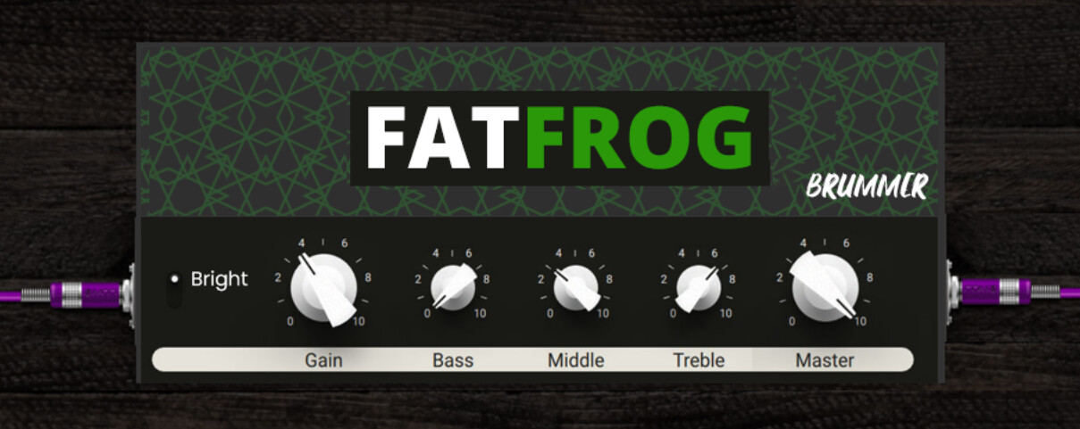
it could even be slightly less wide than I made it here
One of the main reasons for the style guide we want to make is to set a max size for amps so they are less wide like this. I never heard the term “lunchbox amp” until @LievenDV said it here but I think that Lunchbox amps are ideal for the MOD web GUI. If there are more knobs needed then just make a second row of knobs
I think this is also a good example of a nice mix between
A) being recognisable as an amp
B) being practical, easy to read and tailored towards usabilty in a GUI
2 Likes
idd, they have an optimal size.
The term has been going around for a long time and it has been a novelty for a while but last couple of years, the mass market offers interesting stuff. They gained credibility in the High gain market.
They set the trend for guitarists being tired to dragging all that heavy gear around.
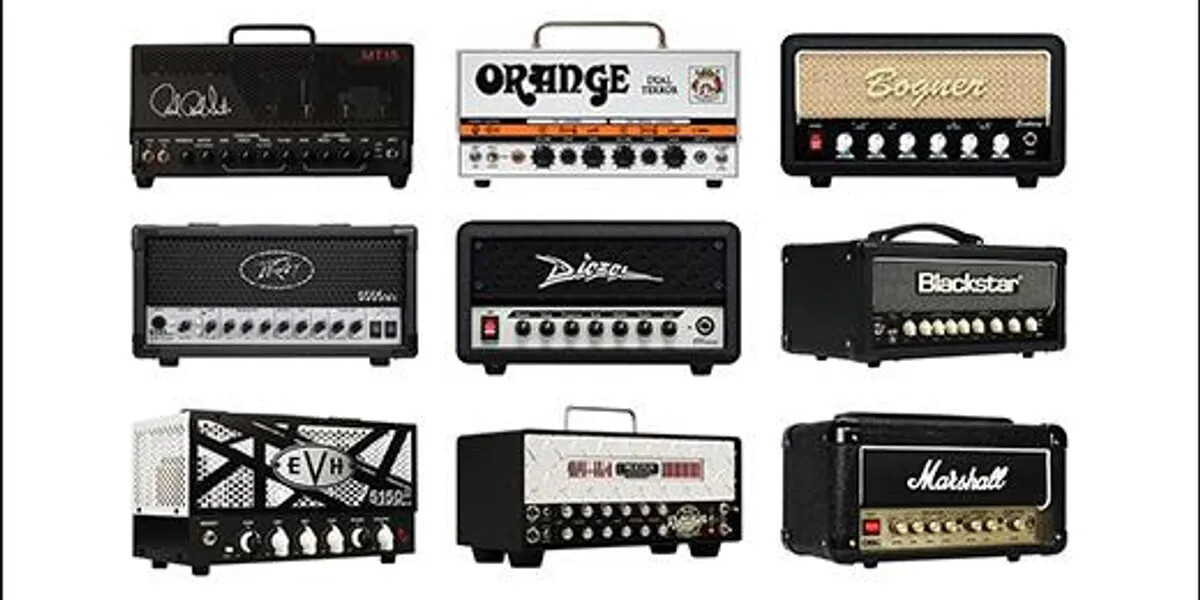
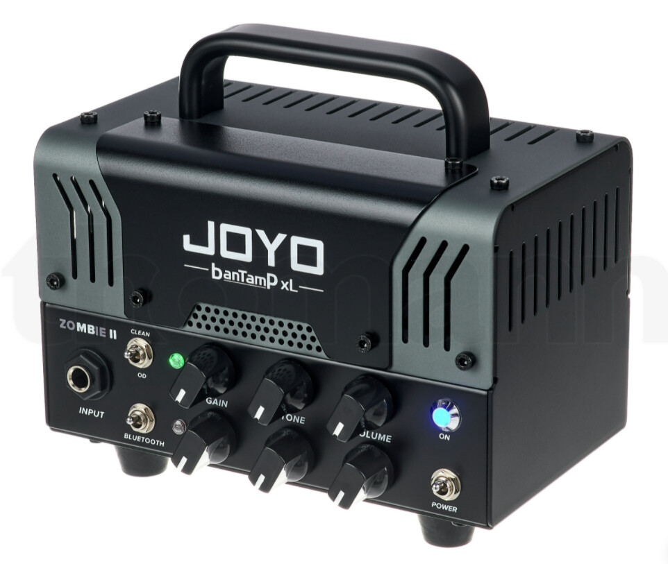
I have the V1 of this Joyo “Zombie”, that emulates a Mesa Boogie.
use it on a 2x12, sounds awesome for what it costs (€160!) and our lead guitarist was considering getting one himself.
2 Likes
As someone who has been following this thread since the first post and without a single idea of visuals and stuff, I agree that this is the best option. Easy, simple but recognizable.
1 Like
+1 for the Joyo. V2 is my main practice amp. Works great with the dwarf.
As I said @James the knobs are straight from Guitar Rig 6 - so you do have to change the style a bit.
I know it’s @brummer s work but maybe changing the knobs to a stylized look after the knobs used on the Dwarf and DuoX Hardware connects it more to the platform - more cleaned up and prettier of course but you know.
3 Likes