For scalable UIs, don’t forget about CSS, the whole canvas HTML5 API, or even WebGL.
It doesn’t have to be strictly SVG, there are quite some options.
The modguis for the audio file player and notes plugins are scalable (except the knobs and switch on the audio file player, but those could be easily replaced).
I only did some basic tests before, but it is possible to leverage WASM/Web-Assembly to code something that is typically used on the desktop to go on the browser. How much this is wanted I am not sure…
MOD plugins in that style could look super rad, and would be easy to produce. I have no talent when it comes to graphics, but when I dabbled in game dev, vector graphics is what I used because it’s the easiest style for non-artists to get into.
It’s also well-liked by programmers because SVG eliminates scaling issues among other things.
It seems like the best of both worlds. Since MOD is user-driven, and LV2 is still a niche it’s probably better to go in a direction of something that’s esthetically pleasing while easy to produce, than to rely on rare people who are actually talented like @Kim.
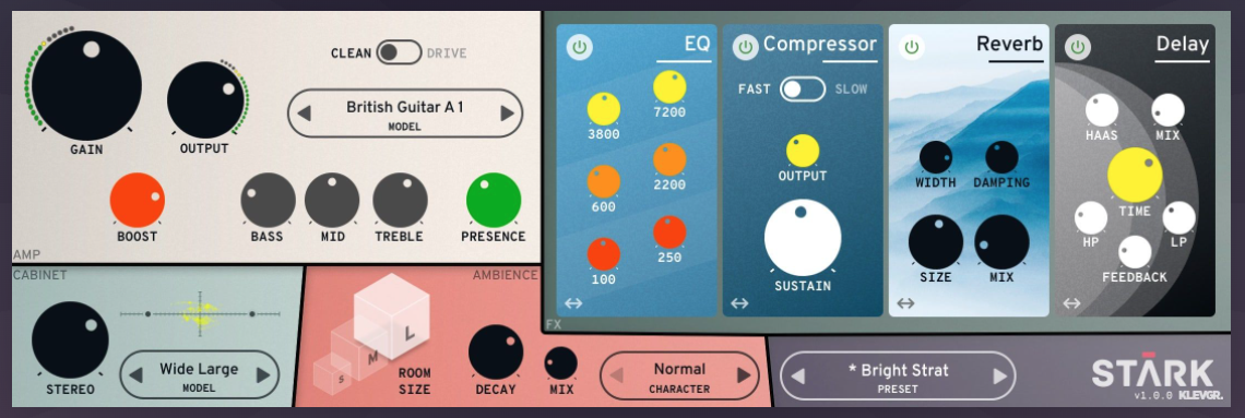
This “Stark-style” flat pedal design that I attached above, is something I could recreate in Inkscape over a cup of coffee, despite having absolutely no talent. I’d imagine that @James or whoever is handling graphics in the MOD team could bang out dozens of similarly-looking knobs and backgrounds in a few evenings to substitute the currently available/used templates.
I’m sure it may not be to everyone’s taste but I’d assume that the compromise of aesthetics and accessibility that a similar style has is hard to beat. Besides, if you look at the GUI of Helix/Quad Cortex/Boss GX-100 or any other multi-FX processor - including those that are not strictly for guitar - you’ll probably find a variation of a similar, minimalistic, flat design.
I must admit that I don’t like those flat style. For my taste, the usual MOD design is much more to my taste. I like it with a touch of skeuomorphism. A lot could be done sure with vector based graphics, and some CSS tricks. This one, for example use a flat png which could easily replaced by a svg file, the rest is done with CSS (and javascript)
I am with brummer on this. I even like such reduced graphics, but everything has its purpose. The aesthetics of the cables, the background, the previous plug-ins: the aesthetics are completely different and mixing them now… well…
I am also a fan of vectors, no doubt. But the purpose seems to me to be rather wrong here and I also have nothing against pixels, to be honest.
What I also don’t understand is the desired scalability. It is only displayed on a screen in 72 dpi and then also in the maximum size of a postcard. It is not meant to be printed. Why scalable…? If you make the pixel graphic large enough, you can catch all screen resolutions. I haven’t understood this reason yet. But I like to learn…
I know you said u are not designer but why not refresh or modernize this design? I really loved winamp but it looks so much 90’s shareware. It would’nt take too much effort to do and the cut off text would bug me (not as a user but as a creator).
Sorry if this comes across a bit too harsh. I know functionality comes first and for me it’s not a huge problem when somthing works great and dosn’t look to my taste. Better than the other way around. And I know this is not your job that keeps paying the bills but for a new user or someone who is interested in the platform I think looks are bit more important. There a lot of great looking plugins (k-devices, looperlative, SubSynth, NoiseMaker etc.) so don’t take this as a general assumtion but more of a small detail.
This is just a prove of concept, working with output ports and javascript, not something which will ever get into the store.
The text cut off is a missing padding in CSS which I fixed after capture the gif. I just wanted to show some 3d shading done with CSS.
I thought some of you might enjoy this article, no matter which side of the skeumorphism fence you’re on. Or maybe I like it because it seems to confirm my biases.
It also features circular rotating knobs, surely the most pervasive/least useful UI element in this type of software. A circular control is extremely difficult to operate precisely with a mouse, but no matter; they look “cool,” or something.
Anyway, keep up the great work everyone! It’s fun to see all these different perspectives, and hopefully everyone’s efforts find a happy home whether it be for other/future plugins, promo artwork, thumbnails in the store or in the plugin descriptions for example.
Until now I have only used illustrator but I was thinking on the trip home, I should download inkscape so we can all start sharing files. Perhaps we can start putting together a new set of assets in the repository together. I surely could use some help so it makes sense if we’re all on the same platform.
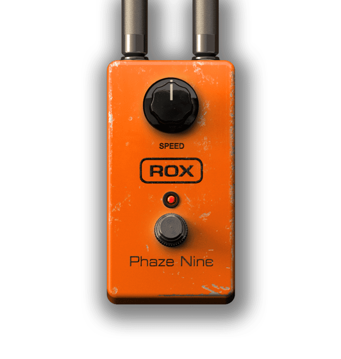
This is really cool. The only thing I don’t like about it is the metal like texture. I’m not against having a texture to make it look like metal but I think it really needs to look real. I think either go full realistic or full simplistic, not somewhere in the uncanny valley. I really like the elements in this GUI though.
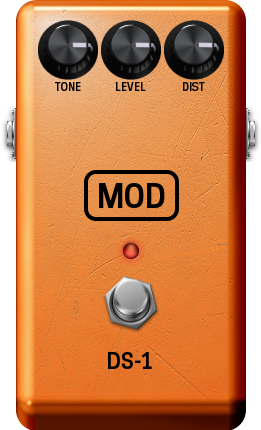
I like skeumorphism too but it takes a lot more effort to make it look convincing. I personally don’t think our existing templates come close to looking realistic. Take the ds-1 for example
Compare that to the phase 90 on amplitube
I think skeumorphism is cool if it’s done really well. But that will require new 3D models rendered with better materials in a more realistic lighting environment
So one of the problems currently is that most of the GUIs are only like 600-800 pixels so if you are zoomed in on a 1080p display you are already getting a pixelated image. A lot of people are moving to 1440p and 4k displays which makes it worse. It makes our platform look outdated or low quality. Some people naturally associate poor image quality with meaning that the audio quality is also poor. Yes you can make higher resolution graphics but the files are larger which means they require more storage and take longer to load when loading a pedalboard. Plus we want to disconnect resolution from the scale on the board so having an svg means its adaptable to whatever size we choose it to be. Vectors also display better at different zoom levels
It’s not entirely true. Adjusting a knob works exactly the same as a fader. You just click and drag horizontally and the knob turns. You don’t need to drag it in a circle. Knobs have the benefit of taking up less space while having the same operation
I think a few people like @Kim, @LievenDV and myself are down for creating assets - or at least pitch in with ideas. I know a little bit of design and how to create it (adobe, blender, fusion, css). Maybe a seperate channel for this will be best where you can post needed work or a developer needs some help with the visuals.
This is now exactly my domain. This image is rendered. We do this daily for realtime-engines with so called PBR materials (Physically Based Rendering) or Substance shaders. But at the end it is a pixel image. It is not at all vector. It is a special shader but if you go near by the edges will be clear but the image will be pixelated in engines. But this is not even a realtime-engine, it is a simple image and it will be fully pixelated if you go near by.
We absolutely have to agree to one method. Up to now we are talking about a mixture of nearly everything which is quite anoying. You also contradict each other in your methods. What exactly do you want? Before continuing we will need a proper guideline otherwise we will waste time (as I allready did).
Yes you are quite right. This is the example I gave of going full realistic (3D rendering) vs going clean and simplistic (vector images)
I’m well aware of how 3D rendering works. I made all of the 3D renders and animations you see of the Dwarf and Duo X on our website, advertisements and even the banner of this forum.
Sorry I’ll try to be more clear. I thought i said it earlier in the thread. Some devs want to have simplistic images, some want to have realistic images. The vectors images do load faster, scale nicer and can be a lot faster to generate. But we still have to support bitmap images as we have hundreds of plugins with bitmap GUIs and it’s not realistic to update them all. So we create templates for both with a preference for SVGs for the near future and we create better 3D rendered bitmap templates once the design guide is established and we look into optimising the file sizes fro higher resolutions. (Perhaps by using webp or something)
It’s also possible to have bitmap images embedded in svgs so we could experiment with hybrids where only the background is a bitmap and all the controls are vectors
At the end of the day, it’s up to the devs to decide what they want. I’m only making suggestions and trying to work with you guys and put our heads together to work out how we can all get better results and make the process easier
We can argue about artwork all day, but at some point, I am imagining/hoping for a platform feature that would allow the user to skin their own boards.
The first thing I ever learned about Linux was how to go about personalizing my interface. All the features remained, but were presented in a way I designated for myself.
I like the minimal pedal designs, and want the option to skin my boards anyway I want.
Every single one of these artwork suggestions posted are valid, and each person has their own opinion on them.
We got a device that lets us create anything we want, I’m hoping the platform as a whole begins to embrace the Libre side of expression.
I’m totally cool with any of the artwork provided, as another person, just like me, spent the time to create. That deserves the utmost respect that I have.
That being said, we all have our own personal feelings on aesthetics, and I think it’d be dope to be able to squash the arguments by letting the users theme their device the way they want and having default art for the pedals themselves.
I know, this wasn’t meant to me, but, I want the background image, if possible without the brand “brummer” and the LED for the Rumor.
If you send them to me I’ll replace the current odd one.
For the CollisionDrive, the only part I don’t like so much is the Gate knob, there I need one a bit closer to the original, or at least one with comes closer to the angle used in the rest of the UI.
I’ve thinker about blue fonts, but decide against. The screenshot tool makes all fonts thin, in the interface of the MOD the labels are better readable.