Another advantage of the CSS approach is that the CSS can be swapped out for different contexts. for example, a mobile stylesheet might have simplified controls to fit the screen better as opposed to the normal desktop browser display. Though, as you point out, the trend these days is toward responsive layouts.
2 Likes
The desktop software (HX edit), available in high res looks almost exactly the same as what’s on the device. It’s not a compromise, it’s about making the UI readable and aesthetically cohesive with the added benefit of being easier to create (though not necessarily easier to design, that’s where guidelines would come in).
2 Likes
I like everything about your post.
The more i think about it, the more I’m convinced that different views are the best way to put the MOD system to it’s maximum potential.
The “information” underneath is always the same, the trick is presenting to the user a view to only the relevant part of the data for a given task.
The “rack view” is perfect when you don’t want to recable your plugins, but only neet to tweak volumes, reverber times and generally turn knobs.
The “constructor view” as it is is good when you want to add and connect plugins. In case we could have a rack view, I personally think that it should emphasize all stuff regarding connections, for example, a double click or right click on a knob should let us access a popup menu to see/set midi or CV connection for the knob, instead of having to go every time to go to the plugin option popup.
The “simple view”, where you ditch all graphics except for the in/out jacks, could work great for bluetooth/wifi connected control devices.
Let’s not forget that according to all accounts, using the current Web UI with bluetooth is already so heavy that the devs had to develop a dedicated entry point to try to mitigate the problem…
3 Likes
@brummer @James
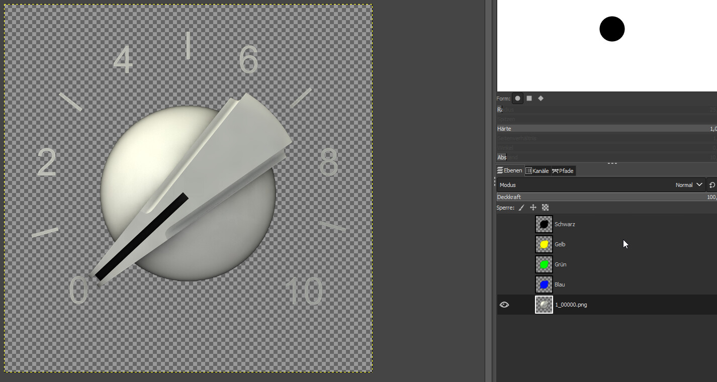
Here are the renders of the white chickenhead knob, 7:00 to 17:00 o’ clock, 64 stages.
4 Likes
It looks like you rendered the rotation as an animation with motion ease at the beginning and the end? Perhaps you can change the motion to linear so it doesn’t ramp up and down at the beginning and the end
Oh sh… you are right! You can easily feel that we are trained in copying the real life. And in reality this ramping is fine, but not for our purposes. Sorry for that. I will re-render it.
1 Like
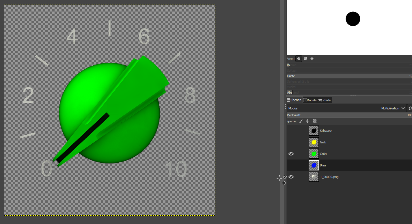
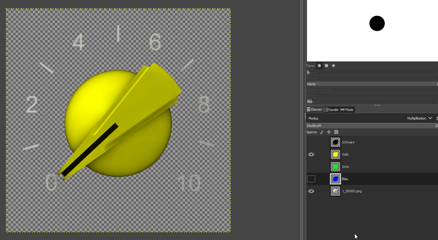
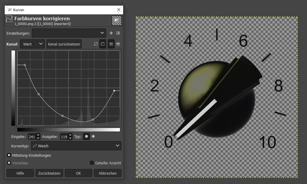
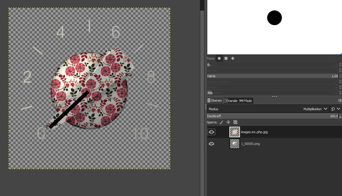
Normally this is done in Gimp (or Photoshop) not in a modelling-application. It has reasons that I’v chosen the white colour. You can turn it in all colours imaginable.
Load the image with white knob
Create a layer with blue in the shape of the knob put it on top of the image with the white button
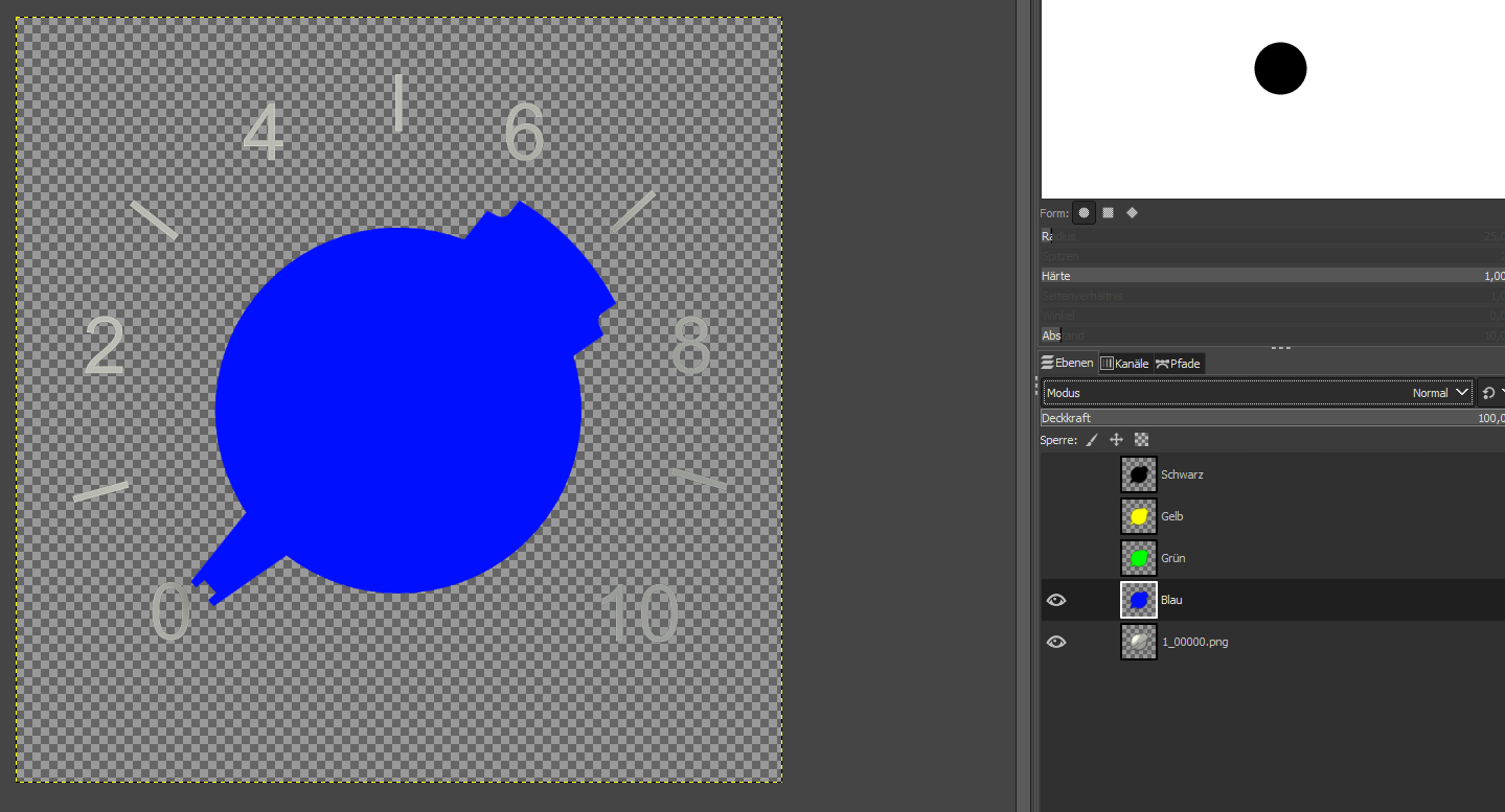
Switch the Mode of the blue layer to “Multiplication”
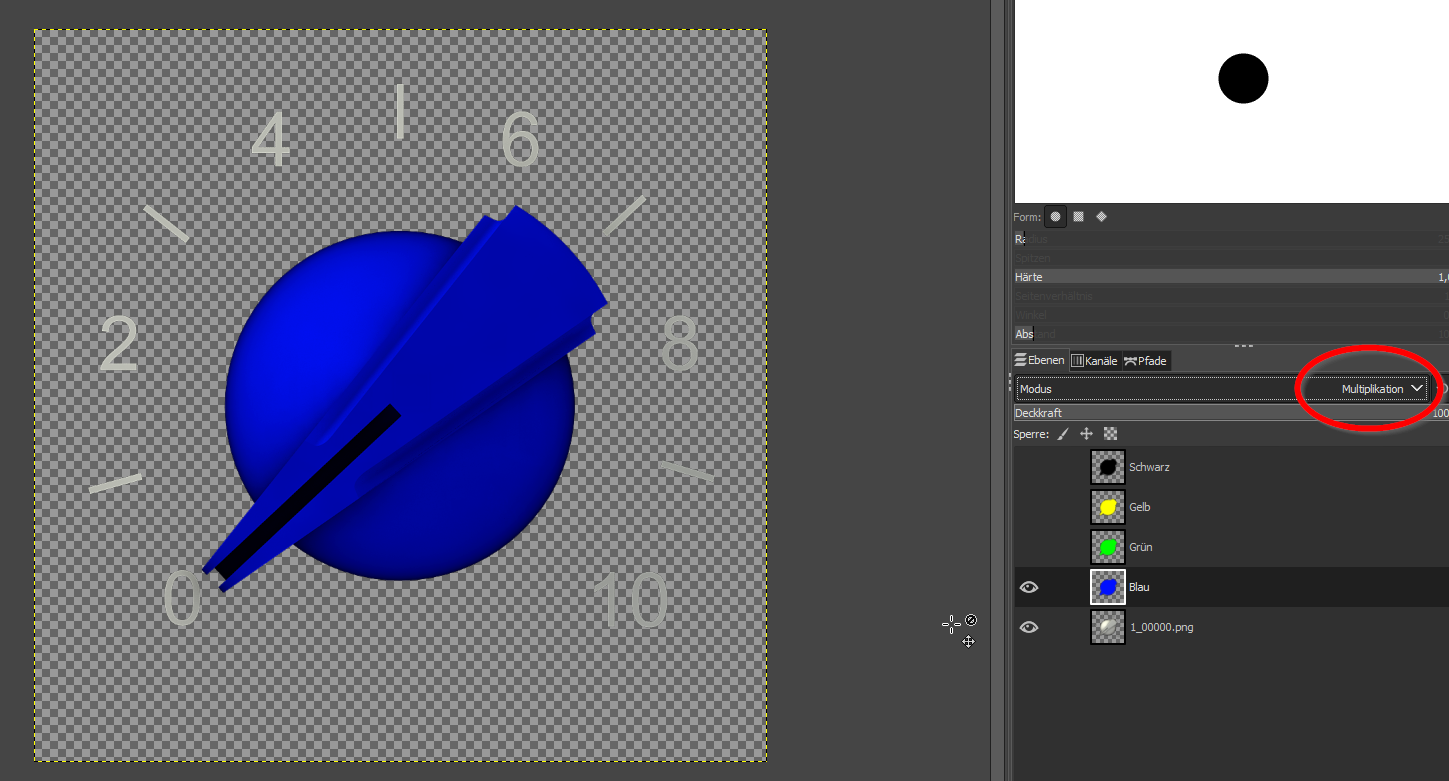
This works with all colours
Instead of black. This must be rendered exeptionally. 
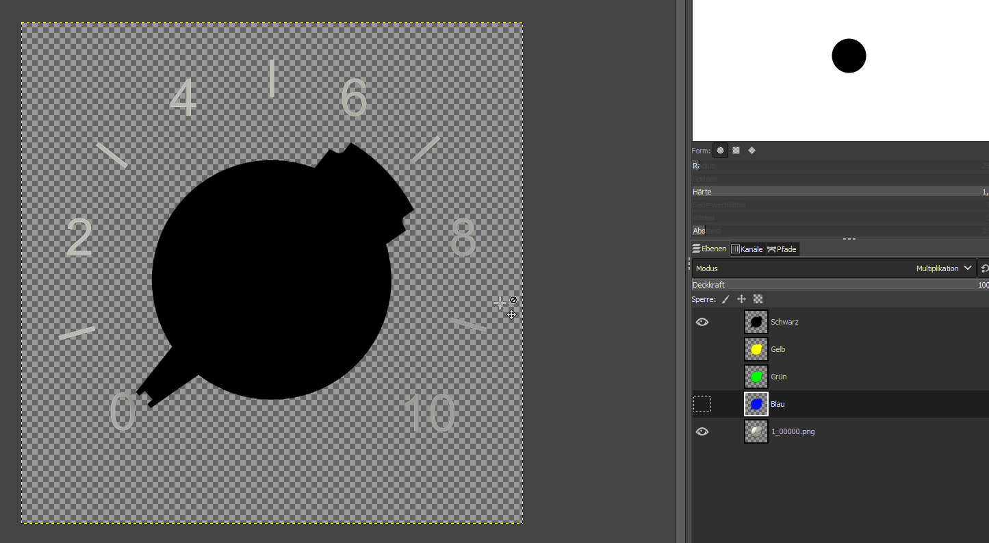
I found even a trick to make it somehow black. The highlight is still in the wrong slightly yellow colour but I guess it could be tweaked (no time for testing now.)
Even with flowers is possible 
Italian Knob
Hippie style
Gamer’s edition
10 Likes
@brummer Where did you take this Gate-button from? Can you provide it? I can tweak it to the right angle, if you want me to.
4 Likes
Yea. I take it from here: https://www.g200kg.com/en/webknobman/gallery.php
It’s the 808_tune.knob, For gate closed I’ve just recoloured it in webknobman.
But, it didn’t need to be this one, but one which comes close to the original used in the Horizon Devices Precision Drive.
btw. Your Chicken Heads comes really nice, I like the Hippie style a lot.
3 Likes
@brummer
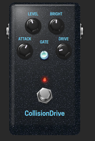
Gate Knob Collision Drive, like the original, transparent, glowing blue when switched on
Gate Knob Collision Drive, 101 stages, gate off can be downloaded here.
Gate Knob Collision Drive, 101 stages, gate on can be downloaded here.
3 Likes
There is a small issue with this knob, when used on the dark background of the CollisionDrive, the upper left side has a hairy outbreak which looks a bit strange:

1 Like
@brummer ah, ok. This is the disadvantage that I could not test it. It is refinable. Just a moment. But the rest is fine? Is it in both stages or only in the switched on?
1 Like
@brummer This is the visible edge of the hole in the housing where the button is located. If it bothers you, I can remove it
5 Likes
Nice! Thanks a lot.
4 Likes
So here it is with the new Gate button (and blue coloured Fonts.
Now I need to upload it and send a pull request to the mod-plugin-builder.
7 Likes
Cool! Looks absolutely fine!  …and very coherent and balanced…
4 Likes
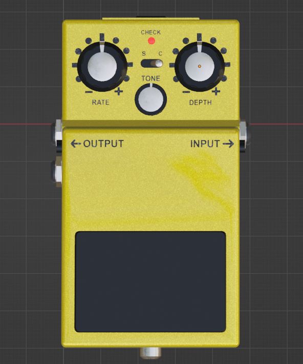
@James In my company we have a training department where new 3D modelers are trained. We simply set a stompbox as the training target in order not to generate any costs for this and to have a direct outcome. You can see the result here. This is a screenshot taken in Blender (not a rendering!).
The whole modelling can also be parameterized, so that you can draw different formats of the stompbox from one file just by changing some parameters. It is also possible to build different buttons and different types of stompboxes. The downside is that they become pixel graphics.
I’m getting a Blender training file uploaded and will make it available later. You guys can take a look at it at your leisure.
6 Likes
This is pretty cool indeed! It looks pretty similar to a boss pedal. I think it would be nice though to make something in the boss style but more tailored towards on screen use rather than real world use. For example, the pedal takes up roughly 60-70 percent of the usable area because in the real world, you need the leverage to press down on the button, but on a computer it only needs a click, so this section could be made much smaller to give more space for knobs. I think if the proportions were adjusted so the switch takes up less space, it could still be recognisable as a boss style pedal while also being more useable in a GUI environment
I would also be interested to see some renders. For our use case, the IO jacks aren’t needed
4 Likes
@James I agree completely. This stompbox has been modelled according to some photos of a Boss stompbox. My company is specialized in copying real exisitng assets that is why this approach has been the most simple one for us. I agree, this must be tweaked now.
Nevertheless you will find the Blender-file here. May you can play around with it to get an idea if this could be a manageable way to create Plugins artwork. As allready mentioned: Renders are Pixel-graphics, this should be in your mind.
5 Likes
I like every place this thread has been up to now.
I’m fascinated by the creative ping-pong to unite the old with the new.
I hope there is a lot of inspiration to be scavenged for the MOD them when working on that “interface” layer of their infrastructure.
I love the idea of compontents that are wireframed for modern, digital use but with the identity of the hardware wel all known, unting as much of the pro arguments already made in this thread.
5 Likes