State of the current plugin UI/UX

I’m feeling bad for hijacking the thread about missing plugin UIs so I’m starting a new topic.

The most of the current plugins are pretty wasteful regarding the space they require. If you look at the example below, you see that the magenta tinted area isn’t really serving any purpose.

image

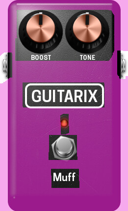
While this is ok in a small chain of a few pedals, it can easily get frustrating when you really want to use the capabilities of the MOD platform. There you are likely to deal with 10-20 pedals so you start scrolling, zooming and arranging a lot. But even if a signal chain is smaller, it can get messy on small screens like on mobile devices (The tool of choice when gigging)

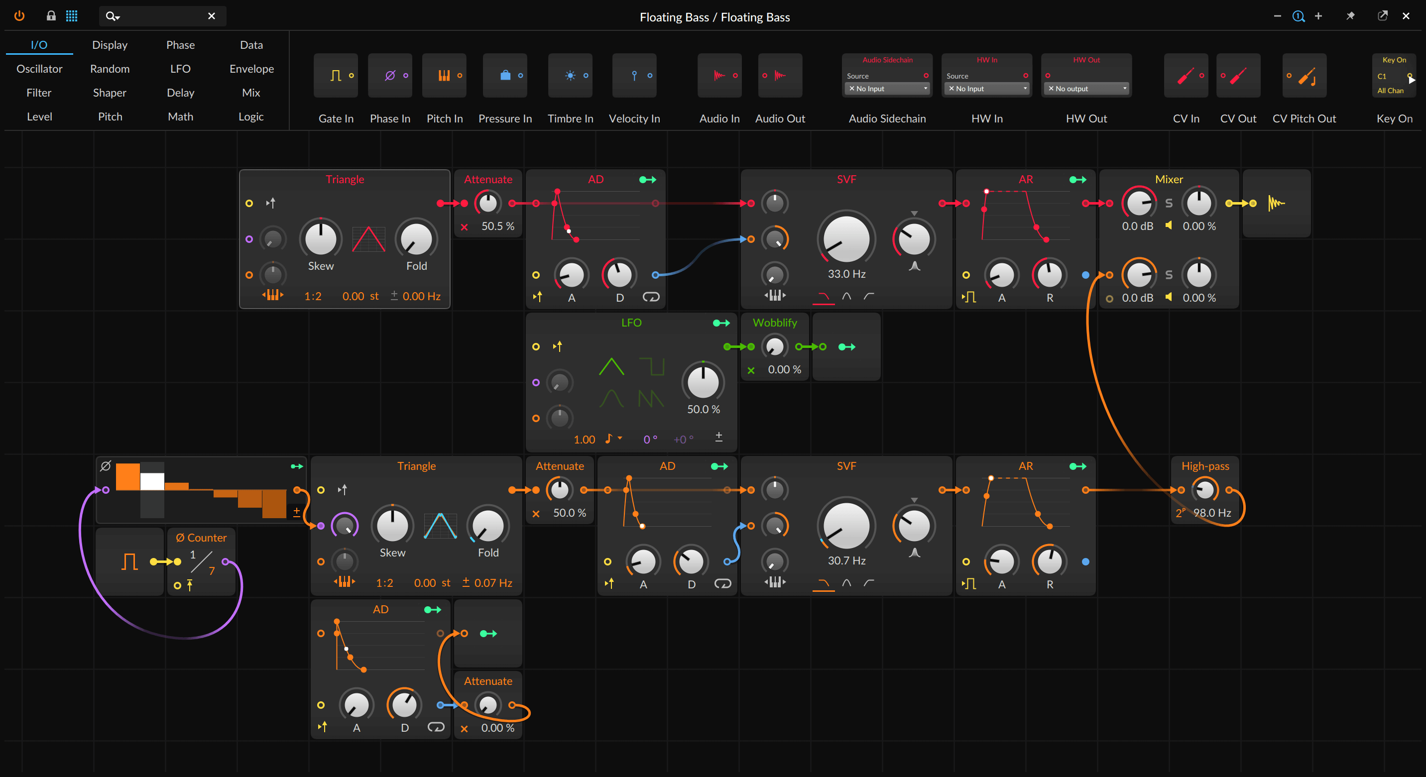
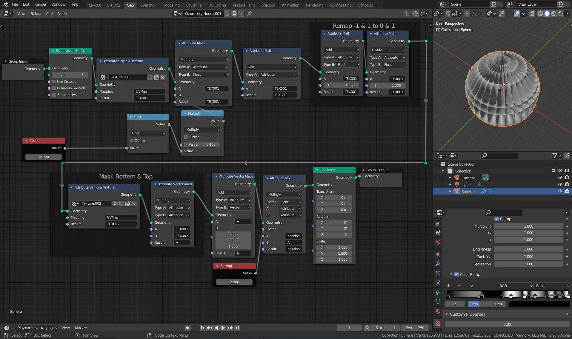
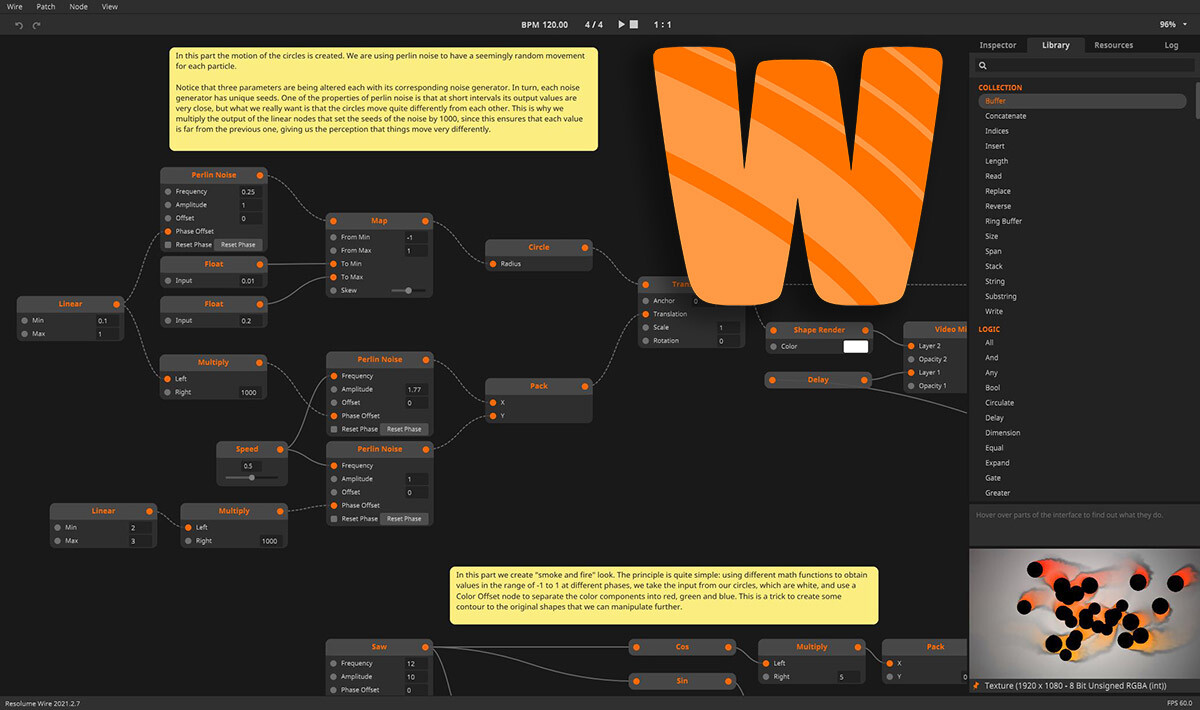
In the other thread I suggested a different UI which is more focused on that purpose. For example have a look at these:

Bitwig (Grid)

Blender

Resolume Wire

There has been already a minimal mode suggested which is even more reduced to just the name and IO harnesses. I consider this too extreme because of several reasons:

  • It’s hard to see what exactly is going on in a patch.
  • Each adjustment will require at least two clicks, one on the node and another one on the actual parameter. This makes editing harder.
  • It might encourage overly complex effects with too much parameters since there’s no visual boundary

If this is done carefully, I see the chance that plugin developers (or maybe just those who porting stuff)
have to bother less with UI design if they don’t want to while users don’t have to deal with those ugly tins anymore.

I also want to answer some of @James comments in the other thread.

First of all, this is actually already a problem with the current UI. In many cases, there are hidden parameters only accessible via a separate menu. Second, my aim would be providing a UI which is just more functional by neither hiding nor bloating anything.

In my opinion, most of the current plugins would need a redesign because it’s already out of hand. :stuck_out_tongue_closed_eyes: I consider visual resemblance important as well. But have you actually done any UX surveys backing the claim that each plugin has to look like an actual piece of hardware?

8 Likes

I think that something that resembles the example below could be very appealing to guitarists/bassists.
I like a lot the grid idea.

5 Likes

I think if UIs get too generic it would be very hard to read a patch, especially since many plugins have way more than just a couple knobs (some have many dozens, even hundreds are possible).

While I see the use in being able to switch between a “fancy” and “generic” patch UI, having just generics like this would not make patching a very enjoyable experience.

Also for any vendors/brands that want to sell or promote their specific plugins it would not be favorable to not be able to stand out with their own design identity.

5 Likes

I`m sure you read through the [gui and artwork thread]

In general Im all for this simplistic node based style with some kind of incorparation of unique styles for some plugins. Its tough to balance between user who like to dive deep into stuff (me) and users who just want to get stuff done.

3 Likes

I completely agree. I went into a lot of detail about this in the Plugin Artwork topic in terms of the amount of unused space

I get it but if you show all the parameters, it will start to get back to the same size as actual GUI (after GUIs are optimised) Though I do see an advantage of listing the parameters like on “Resolume Wire” in that it would make cv routing really easy

I think the answer to that is to just replace the tin with something less ugly. Perhaps a nice solution would be to have a kind of node view underlying all plugins and if a GUI has been added to a plugin it will appear that way. If not, it appears like a simple node where the IO and parameters are automatically populated in a very simplified way like the “resolume wire” example. Then the user could have the option to toggle off all GUIs so that every plugin appears that way if they want

No denying it is more functional. A Tesla model S is more functional than a Mustang, but people still like mustangs. We can’t exclude those people, or more so, excluding them would be shooting ourselves in the foot. For many people, the skeumorphic GUI is what brought them to MOD. I would always aim for this to be an option.

I agree that most of them could use a redesign! You raise a good point here that I have been thinking about since the discussion in the Plugin Artwork Topic. We don’t have recent data on the user’s design preferences. I have been thinking about running a survey specifcally on that. I tend to lean more on the functional side too so I am intersted to know where the majority of the user’s sit on this now
I even mentioned it here

Yes that’s another good point. We had some internal discussions about a snappable grid to simplify placement and routing. There are a lot of questions when you go down that rabit hole though

That’s true, this is the reason why guitar pedals use bright colours so you can quickly see where everything is at a glance

Maybe not but it could make it faster. I would suggest that the nodes could be coloured. When we conceptualised “Blocks” we had an idea to make them coloured too for that reason. Easy to group and easy to identify

True, we can’t overlook branding

Yeah this is why I lean more towards having the option

2 Likes

I think this is the “best” solution. similar to CSS switching based on @media rule. Though I do like the idea of switching on a per-plugin basis. But I like the default being the “functional” version with the option for having fancier “skins”. That being said, this is also probably the most technically difficult solution :slight_smile:

2 Likes

Hi @Klaustrophil!

Cool to see you over here from the oXI forums.

I personally agree with changing the gui completely.

I’m on touch screen and am constantly frustrated with the layout, but I love the products so I deal with it.

Drag and drop sucks, it constantly forces a “back button” due to the in-built gestures of the iPad and I spend more time refreshing my board than connecting pedals tbh lol “ah fuck, I just wanted to pull a cable, now I gotta wait for the bluetooth gui refresh…”

To me, the other examples are a far better option for me on touch screen, and I’d love the ability to choose a simplistic gui without menu diving.

I’m generally pretty chill and accept stuff, but trying to zoom out, attach/detach cables (recently the gui has been failing to even present the I/O ports of the pedals I’m working with), then use a touch screen to fiddle with digital knobs is frustrating. The knob assignment process is a slog too.

To actually control the pedal, it’s a menu dive. What’s the point of making a digital pedal look analogue, when you have to open the dang pedal settings to look at the actual digital data you need?

It’s cumbersome in my opinion, but I’m happy with using it as I know the platform will eventually evolve. It’s also light-years above the zoia in terms of programming. I truly consider even these minor frustrations a vast improvement over other hardware options.

That being said, I’d really love to see any of the options you presented as a selectable gui option (for all pedals) in my set up (especially the resolume). I understand my needs are different than others, and what is available is working for many people.

Edit: this isn’t meant to be rude, just wanted to present a little bit of the struggle I face based on my personal set up choices lmao

Edit 2: I use the MOD platform as a sound design tool, and it is by far the most powerful piece of kit I have for it. The hydrasynth I use is the only thing I own that can compete as a standalone device. However, these units give me so much power over monophonic instruments it’s almost disgusting.

7 Likes

I think it is pretty evident that we need to get the data on what people actually prefer
We can make a survey though that will tell us only part of the picture because the types of people willing to respond to the survey may not reflect the vast majority of users

That’s why I think that there has to at least be some period where both options exist in paralell. This would allow everyone to try both and switch back and forth. Hopefully soon we will have the ability to make an opt in to track device usage and send the data back to us to analyse. Then we could get a more accurate picture of how many people use each mode and for what percentage of time

There may also be some situations where you want the GUIs and some where you don’t. If that’s the case then it would make sense to keep both modes. Regardless I think it is a good idea to have some kind of “simple mode” / “Node style mode” in the future

I like the idea that it could be used on a per plugin basis to replace the tuna can. I think it would look better and would be more functional which is really a win win

8 Likes

That’s actually the point I failed to make here :sweat_smile:
The current UI should be of course optimized too but what I actually suggest for now is having a second approach at hand for more demanding users and situations.

5 Likes

Which ones you are you meaning in particular? Some plugins are just fully fledged synths so of course it will take space and there’s not too much space to gain. But it’s totally reasonable in these cases. But if there’s a big discrepancy between the accessible features on the frontend of a plugin and the hidden ones in the menu, IMHO something must have gone wrong with the plugin design. (Or it needs two versions)

2 Likes

This is a huge reason why I buy hardware. Most of my synths have a “knob per function” layout which gives me immediacy in my control over the sound I’m manipulating. It’s personally what I prefer, but also have some synths that require a little bit more menu diving. Those synths generally get less use though.

1 Like

You are falsely assuming that all plugins are made for MOD platform, which they are not.
The vast majority of plugins we have in MOD are originally based on desktop versions, which has completely different UI requirements.

7 Likes

Giving my 2 cents on this and after reading it earlier written from you, I agree 100% on this. My only heads up is that we can’t back this data only with current users and people that are already familiar with the platform. That would bias the data quite a bit and not allow us to have a bigger picture. After all, growing the user base of MOD would not only benefit the company, but also the community.

On a personal feedback side, I like the idea that @Klaustrophil is dropping here. I see quite some value on a GUI along the lines of the Bitwig one. But I also believe that something more graphic and closer to what we currently have is important for many users (even those that prefer the nodes option but sometimes already have pain in their eyes while looking at it).
The solution that I see for this is to have two (and eventually even more) views and allow the user to select their default one. Maybe a concept similar to what Ableton does with the arrangement and session view.

This would be indeed a good option. The only downside that I see is that it requires the development effort first, which can eventually be proved as wasted time. I think in the end it boils down to the amount of effort needed vs resources available in order to have this as an option or not. I personally agree that this idea is the best to really evaluate rather than put out surveys (and also like the idea). I’m just concerned about the practical implementation so we don’t leave this as a “nice talk”.

5 Likes

Everything will require effort :sweat_smile:

4 Likes

Of course. But both of we know that is faster to put a survey together than a completely new view for the WebGUI. Yet the second I also believe that would bring us way more accurate data.
Still, this wouldn’t be data from non-users (and that could use the platform…I’m not talking about a random person from the street with no contact with music making lol)

3 Likes

Yeah true. I don’t believe there is a possibility of wasting effort though. With my proposal, plugins would automatically generate a functional node GUI based on the parameters in the settings view. Basically, it would just put the settings view on the board in a more compact layout. Then GUIs would be toggleable. Even with GUIs turned on, new plugins without GUIs would now have an autogenerated functional node GUI that would be much more useful than a blank tuna can and would not require any effort from the plugin dev. I can’t see a scenario where that isn’t useful so the effort would not be wasted whether people prefer to have GUIs toggled on or off

I get that, but what is your idea for getting data from prospective users?

4 Likes

Thank you @Klaustrophil for bringing this topic. I totally agree that this kind of environment would be amazing. I recently became huge fan of Grasshopper (for parametric modelling) and I was thinking about the same. I was not aware of Bitwig Grid environment - it looks so beautiful, clean and very comprehensible! Similar environment would be great for MOD platform!

5 Likes

Yep. This is cool :slight_smile:

Basically understanding how a person not familiar with the platform would understand the platform and how long would take to do it. In my perspective that is extremely important, otherwise, we are shaping the platform for those that already crossed through the first pain points.

3 Likes

I mean how would you propose to do that?

3 Likes

Ah! Gotcha, sorry.
The dirtiest of the ways is to do sort of a school trip with some or even one of us. Meaning: grab one device, arrange a meeting with one musician that never used it (better even if never heard about it) and simply popup (by his/her studio or so) give him the device and check how fast he gets something out. Then have a small and open list of questions on the things that we want to get feedback and record or somehow store his/her answers.

I don’t see any way more open and less biased.

3 Likes