Hello, I think that managing pedalboard with a smartphone with bluetooth would be a great feature.
It already work with the navigator but it’s nearly impossible to turn the buttons of a pedal.
I would suggest something more minimalist and pratical than zooming into pedals, somethings like a list of pedals then a list of button/controller by pedals.
Maybe no need of an apps, maybe juste an alternative UI for smartphones.
However, I believe that this adaptation will require efforts, since the project was apparently assembled with a client-server structure, something like when you access a website: The browser requests the information, the server mounts the page’s structure and returns the interface.
Moving to mobile devices requires a reimplementation of the GUI so that it can be “independently generated” from the server so that it can be inserted into an application installable.
Bluetooth
There are currently two ways to use bluetooth with mobile devices:
Create applications: Which may require a large effort as commented in the above section;
Use in browser via web-bluetooth API: Unfortunately [support is still small] (http://caniuse.com/#feat=web-bluetooth) (and is not retrocompatible with older mobile devices), so that Maybe now is not worth investing time.
Alternative mobile interface
One of the challenges of building systems that meet a large number of people is to address the many ways they consume content across a variety of “media” (computer, notebook, tablets, smartphones). One way is to develop programs for each “media”, which is very costly - mainly to offer updates.
The strategy of offering a website (which can be accessed in almost every single browser) enables the production of a single program with quality.
So by my analysis, an addition of a more simplified additional viewing mode (light / minimalist mode), as suggested by you, appears to be the easiest way to meet this demand.
Note: I am not part of the project’s technical team. I’m just an enthusiast about audio processing technologies.
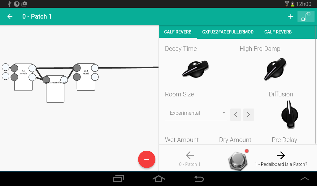
In a post, I commented that I am developing a research for academic purposes with a proposal similar to the Mod Duo. In my project, I decided to make an interface that I thought was simpler to change the parameters effects of a pedalboard.
Below are some screenshots to maybe serve as inspiration for the friend @Fish’s request.
As you can see, I took the liberty of using some pictures of the mod team (knob and footswith). In the application, there is an area to reference all the images I’ve used, including who made them, a link and the use license.
I know so very little of web development, but couldn’t you make the website present a different interface if the screen size is small or the platform is mobile? I know many sites have a mobile and a desktop version and I thought this was all done in the CSS/HTML.
I really like the mockup though. Perhaps instead of the tabs in the view with the knobs you could instead just click on pedals in the patching view, so its scalable for large number of effects and also more like the desktop version. I think the site could/should be made to look like that on mobile, but again, I’m out of my field here.
A web page that presents itself visually different to distinct devices has what they call responsive design. Only CSS and HTML can be used, but javascript can be used as well.
In my project, if I click on any of the rectangles (corresponding to the effects) in the left view, it will be in focus (pink) and the right view (the knobs) will display the settings corresponding to that effect. If I click on a tab in the right view, the rectangle corresponding to the effect of the tab will be in focus.
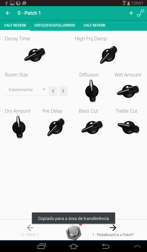
If I double-click on any of the rectangles, the view of the rectangles will hide and the view of the knobs will fill the entire screen (like image 2).
The justification for the right view is always being displayed on devices> + -900px is that after the initial setup work (choose effects, test, connect) I see that the person will spend more time changing the values of the knobs. At least that’s the behavior I observed of myself.
For small screens I thought the tabs would make it easy to quickly select another effect without having to keep going and going back to the connections screen (rectangles view).
A usability study would be very important, but unfortunately it is out of my research focus today.
Thanks for your feedback
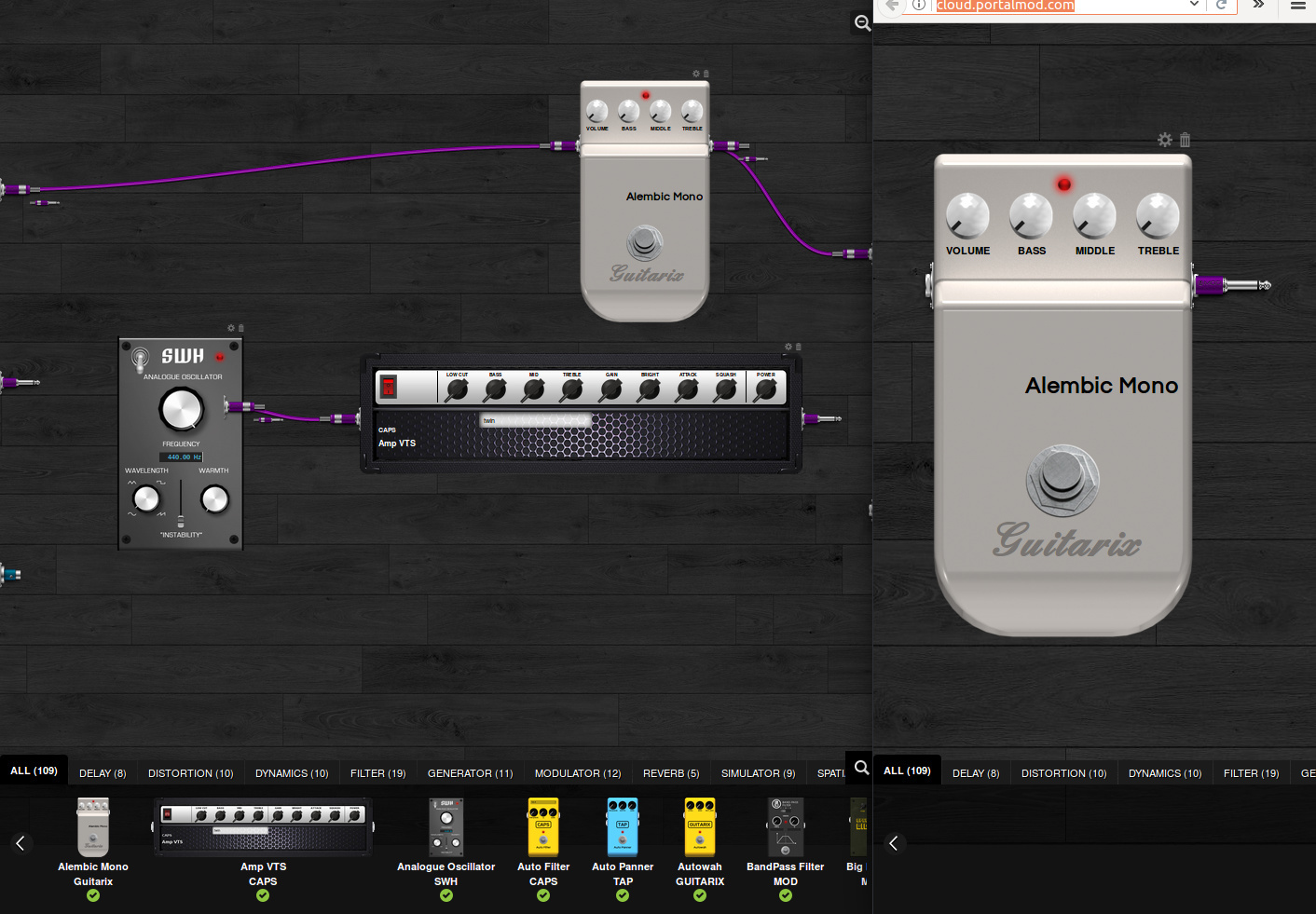
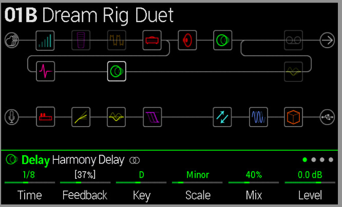
One suggestion for the Mod team is to do is do a split screen, where on one side would be the connections and another on an effect in focus. Example image:
In this mode, on the left side could disable parameter changes and footswitches to make it easier to reposition the effects on touch screens.
Bonus: I believe that replacing one effect with another - which is so important for testing purposes on a device with a wide range of audio plugins - is quite complicated (remove effect, add another effect, reconnect) compared to other equipment ( Zoom, rolland, line6). Maybe this idea of split-pane might simplify this a bit.
(At least I intend to do something like this in my project in the future)
That makes sense, just if you have a board with 20 effects it won’t work to fit 20 tabs on a phone screen. Perhaps some scheme could be thought up that puts them approximately in order so the tabs on either side of the current are the effects before and after. When you have 2 effects going to 1 or 1 to 2 then it gets complicated, but I think it could be possible.
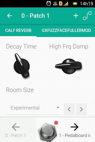
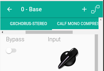
The current implementation does not squeeze all the tabs on the screen, they are under a horizontal scrool (image below, with browser view)
The order that appears is the order that the effects were added, which really is not very intuitive as it does not match the order of use.
I agree with you that it is a good idea to follow the order of connections. To jump-off when an effect connects with more could be the position on the y-axis but it is still confusing.
Perhaps the ideal is a minimalist view of auxiliary effects connected.
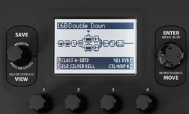
Of other commercial products that I know, what I find most cool to represent the connections in a simplified way are those of Line 6. (I think the connection scheme between effects is not as free as the MOD.)
My laptop have a toutchscreenMy laptop has touchscreen, a touch screen enhancement application would be of great use.
I had thought of creating a parallel environment that would be switchable, with minimalist (and standard) display versions of the pedals with generous drive space (instead of buttons like 3pdt), sliding potentiometers, and a specific place to move the pedal On the set (like a handle).