To clarify I’m not saying one is better than the other. I’m just saying that to have 2 GUIs for the same plug means one of them will go to waste. Perhaps they can both be used but the new one get’s adapted to a different plugin
I think a reason to replace the original GUI would be if the new one was a lot more compact and maybe easier to use on a small screen
There is no other GUI for MOD. FalkTX’ suggestion is from the desktop version of the plugin, which would have to be adapted.
If possible I’d maybe also just use the same assets (may depend on their licensing). As the layout is already exactly the same.
The design of these assets are certainly nice and should be reused for other UI!
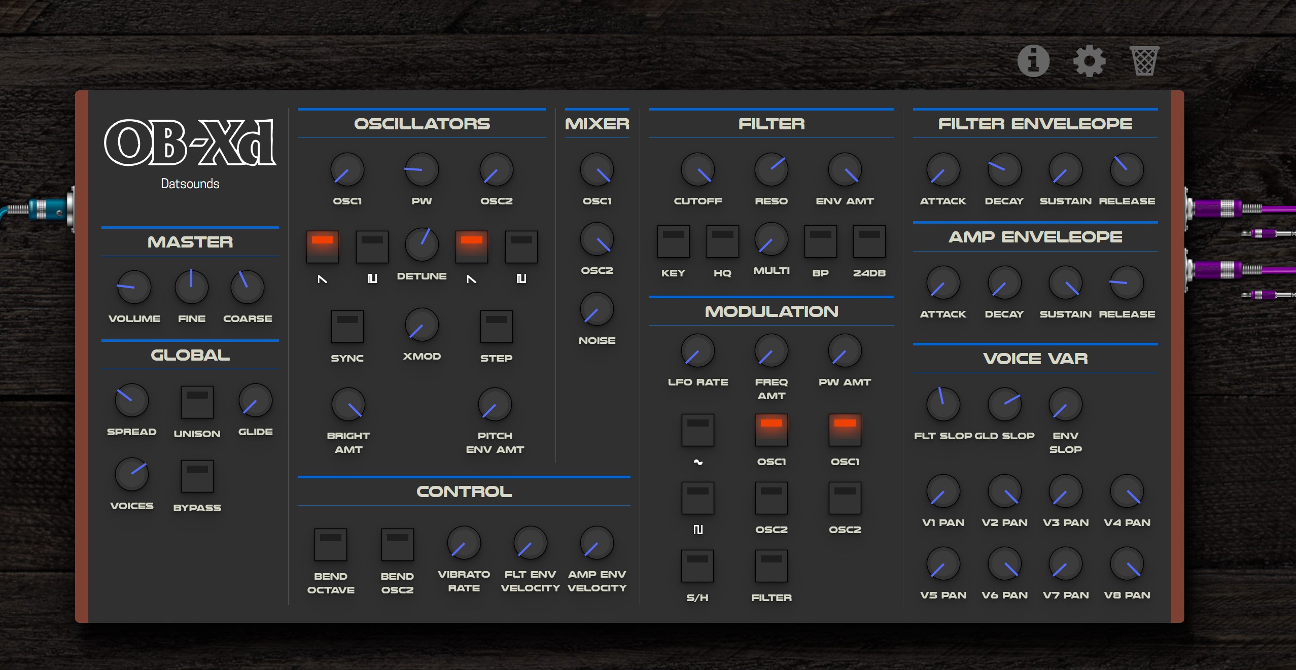
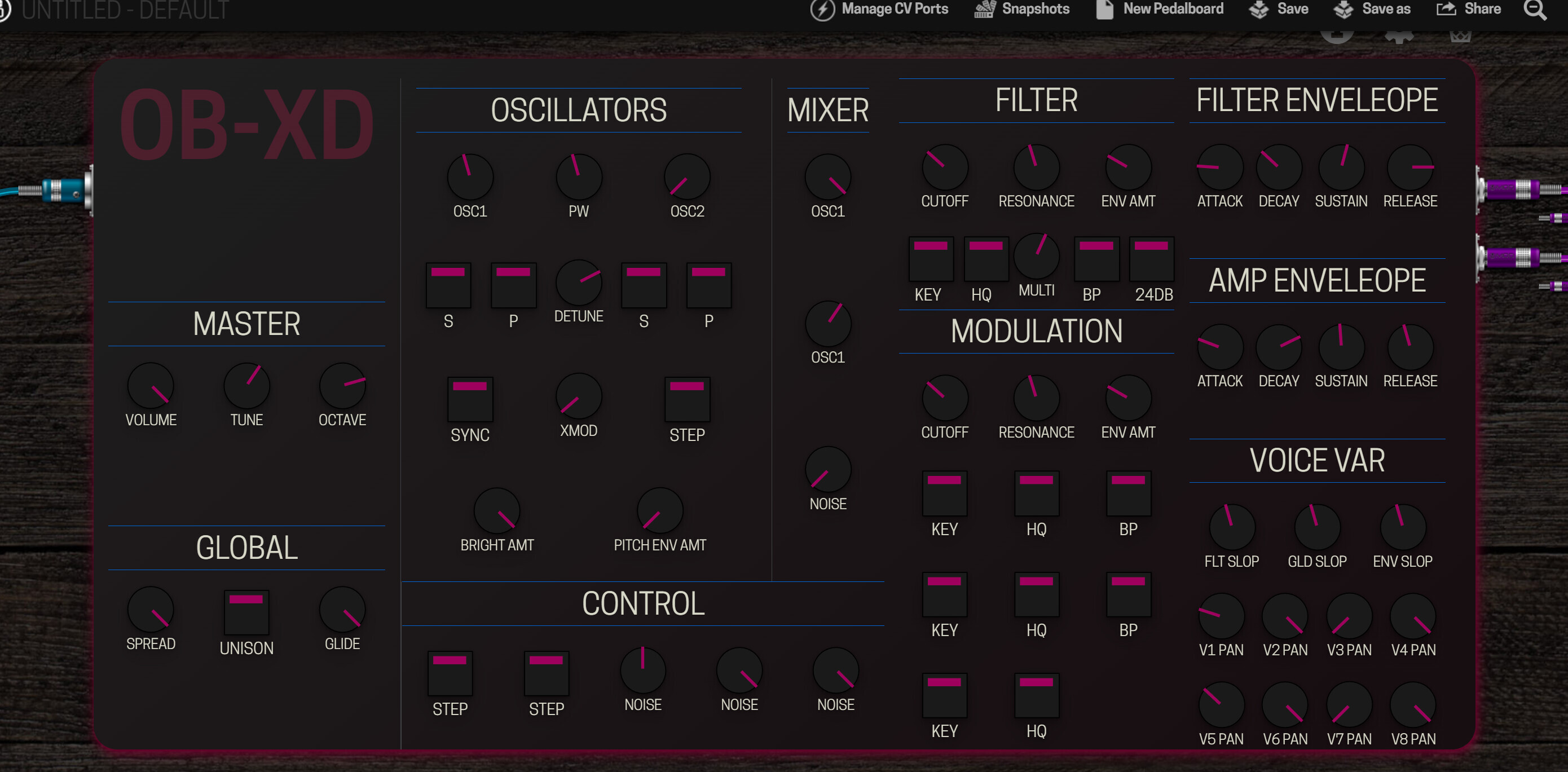
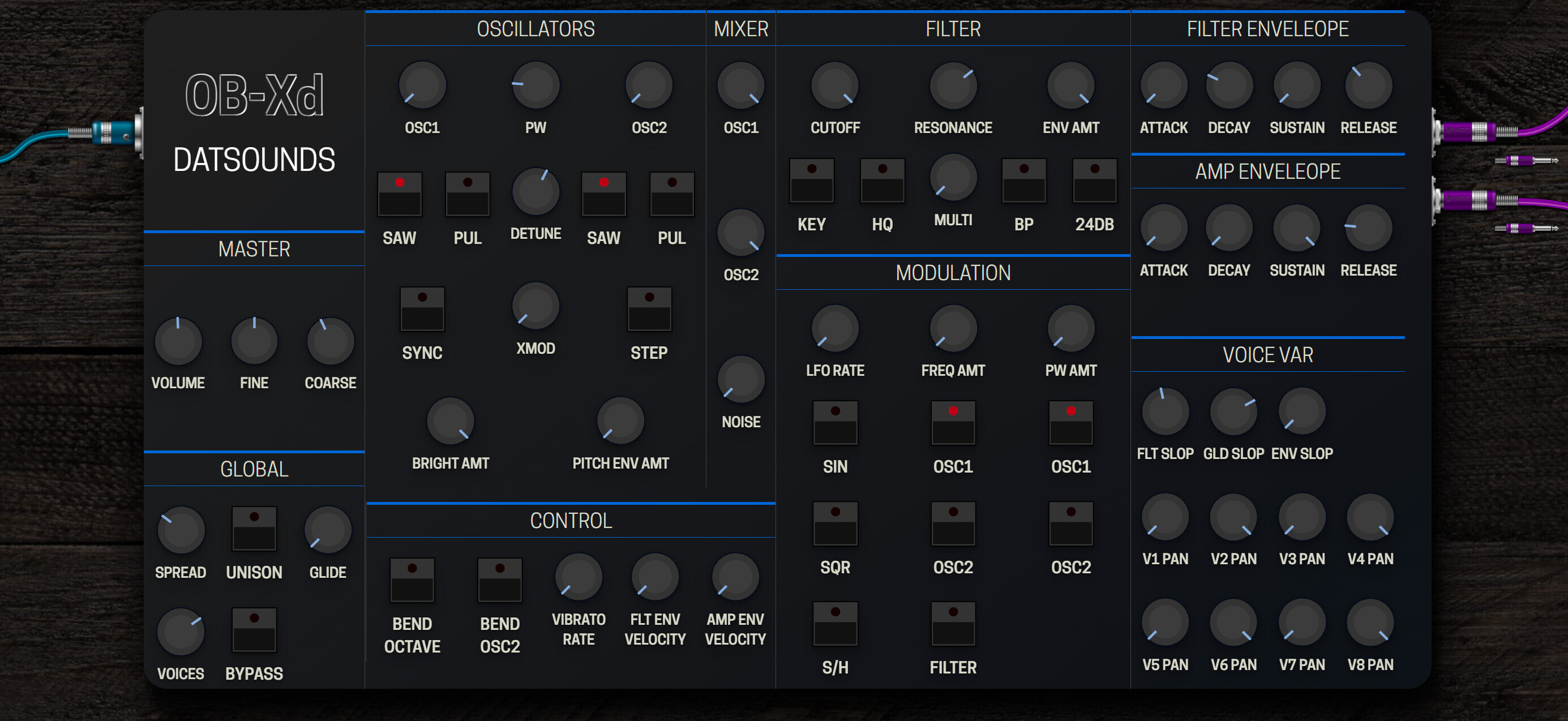
In my humble opinion (even tough I have 20 years of graphic design behind me), the interface proposed by @spunktsch is FAR superior to the “original” one in various aspects: readability, functionality, ease-of-reduction (which is a concept that’s badly overlooked in graphic design world), inversion, etc.
What’s more, to rebuild the “original” design means you have to acquire the rights to it, or to the assets (knobs, keys).
I read the other posts regarding GUI development and, to be honest, I believe it’s better that mod creates its own visual identity or simply let things flow than try to recreate this or that.
Thanks to 2Dat for the original OB-Xd and Soshi Studio for giving the rights to continue this wonderful product. Also thanks to all KVR artists for making the amazing skins!. Source code is available under GPL license at GitHub.
thank you for all the suggestions and responses. @James no problem - as long as everybody can see there is new gui related to an old topic im good. @jon started to use it because of the instant van halen sound and its lots of presets. Which need to be converted next.
I’m also torn between the old and ‘new’ design. The original looks cool (for quickly dialing in presets) but as @delaylover mentioned not as easy to read on a quick glance.
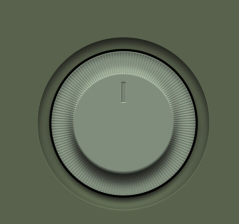
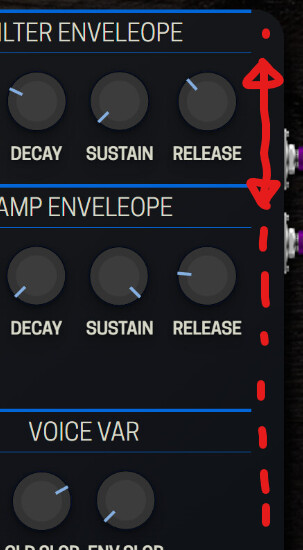
The assets I created are 3 lines for the knob and 3 lines for the button - all svg code. The rest is a css grid with a gradient background and some shadows - again I wanted to start with a bare minimum flat design.
On the plus side: this can be adapted pretty easily for most of the plugins with no ui (eg. Aether is next)
@LievenDV@dreamer 100% - i’ve noticed that I’m pretty rusty all things css and already noticed the lack of contrast and spacing.
In the long run I’ll try an svg version of these kind of knobs (+ an indicator)
Perhaps it would be good to see your design with this style of knobs but with the colours of the GUI more closely following the original GUI and even with the strips on the side
In this case, it is a direct recreation of a real world device so I think the resemblance is useful
I think optimising the scales of things for on screen is a good idea to make things easier to read and use but I feel it would be nice if the colours and textures were a bit more true to the original. Not that it can’t be a “flat” design though
@James, hope I didn’t rub you the wrong way. It is a real world device, I agree, but this knobs in @spunktsch design are much much better to use/read than the original ones under most circumstances, such as low light, small screen, etc. This is just my opinion.
Now the fonts on the original one are certainly better, no question.
Also, looks like it’s been available since 2017 but it’s getting a GUI just now, so to further dwell on a cool design and leave it unattended doesn’t seem like a good approach.
Of course not! If anything, I worry that I’m always being too opinionated. You guys are seriously all great and there is never any harm taken on my side. We evaluate the ideas not the people
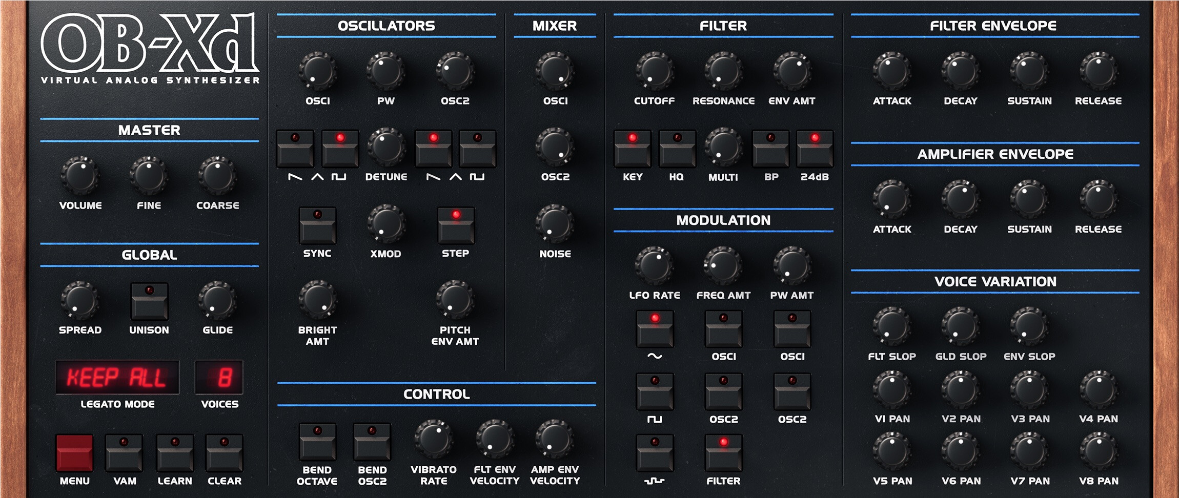
I agree, the new knobs look much better and I agree the old font is maybe easier to read, and the iconography. I think a new design that resembles the old design more but with nicer knobs and stuff would be ideal!
@spunktsch 's design can for sure be used. Maybe a middle ground is the way forward
it looks very nice and I like the OB-Xd letters to the left.
I like that you went for the same spacing of the voice variation parameters like the voice pan knobs and that you didn’t abbreviate all parameter names.
Looks nice! I think somehow I had to update to the latest 1.12RC? didn’t see the modgui before I did that.
Needs a couple more handles to move it around (in between the knobs) and double-click to zoom doesn’t seem to work either.
Other than that very nice! I like this clean design. Maybe a couple more small touch-ups, but it’s almost there I think!
What I would like to see (continuing with design #2):
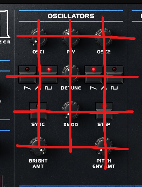
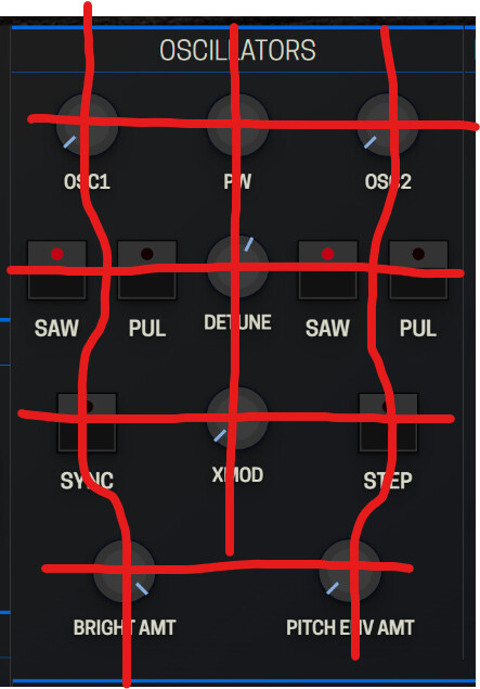
Improve the alignment and layout of controls. If you see the original, the controls have a tighter layout with clean alignment that I think could be adapted
Usually, I would opt to remove things like side ears on rack units or the timber end plates but in this case, I think the wood end plates make sense for recognisability but they could be slim. The right side doesn’t really work with rounded corners because it means you need to have an empty strip there so it might as well be wood.
I think I prefer the buttons from the #1 as the indicator is bigger making it easier to read. It would be good to use these with more original colours
Knobs with indicator rings would be great for readability at a glance
Adding the logo, fonts and iconography like the original would be great
Adding the LCD displays would also be cool
@spunktsch Just want to say that the work you have done is awesome! these are suggestions that I think would improve it in my subjective opinion. I mean no disrespect at all. Internally we always go through this process of revisions and reviews. Criticism should be constructive and never personal. I’m really excited by what you are doing so please, if my comments are discouraging, let me know, because I want to be encouraging!
thanks @James for the feedback. I know this is a public forum and you explaining things for everyone but don’t worry about discouragement - at least on my part. Your comments are constructive and spot on with most things. I’m pretty familiar with the process in design work and know that revisions are standard practice. Even throwing out 80% of work to get the 20% done is not uncommon. (at least I got better at that ration over the past years )
On the suggestions: I’ll try to implement most of it. Some stuff has to be changed in the plugin .ttl (legatomode and voices should be enumerated lists).
I’ll have to check the licensing if I use the original logos and fonts.
The indicator rings and LCD will probably be the last thing because I don’t want to use sprites and need to figure out how to style or rotate svgs on current values.


 )
)