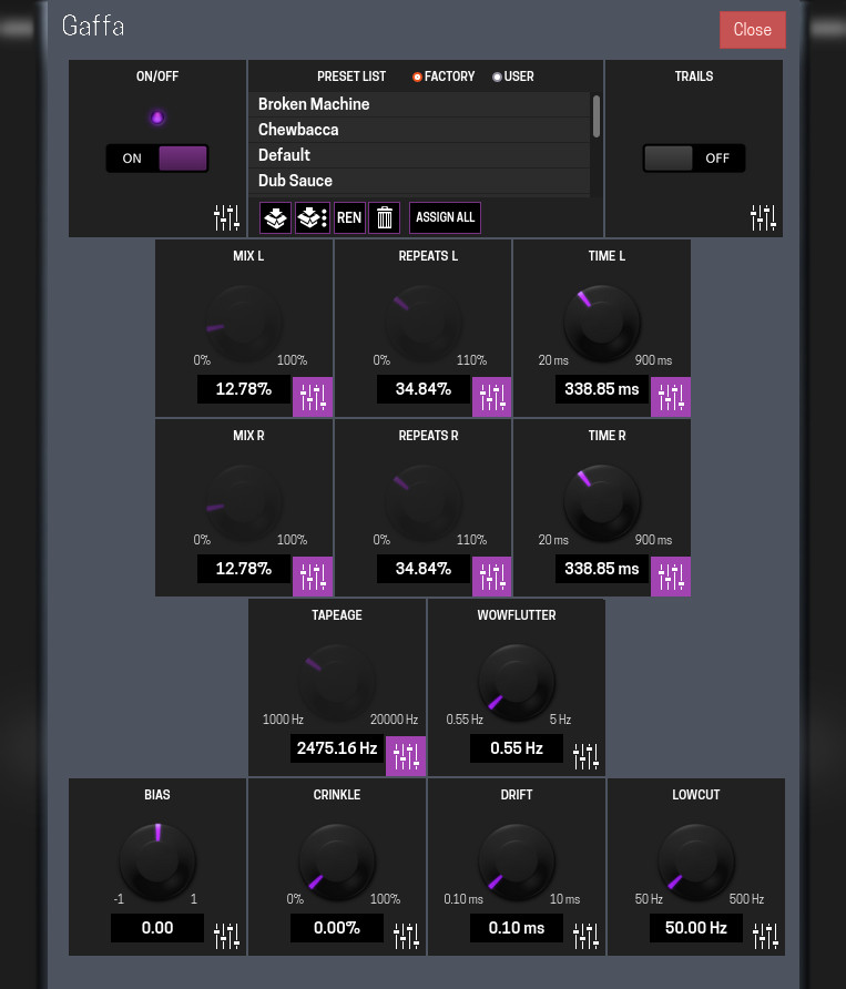
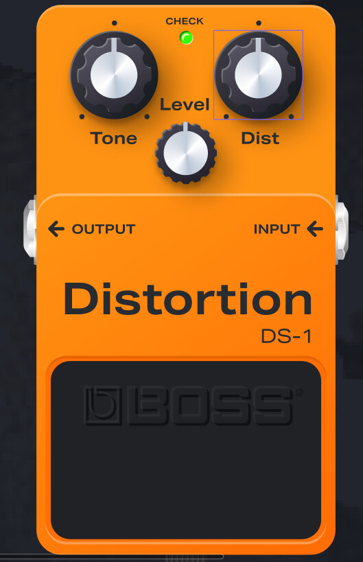
I agree it looks cool
It also points out something that I now see needs to be specified in the design guide and that’s text size. Looking at it on my phone I can’t read the filename
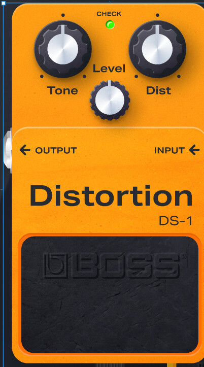
I agree it looks cool
It also points out something that I now see needs to be specified in the design guide and that’s text size. Looking at it on my phone I can’t read the filename
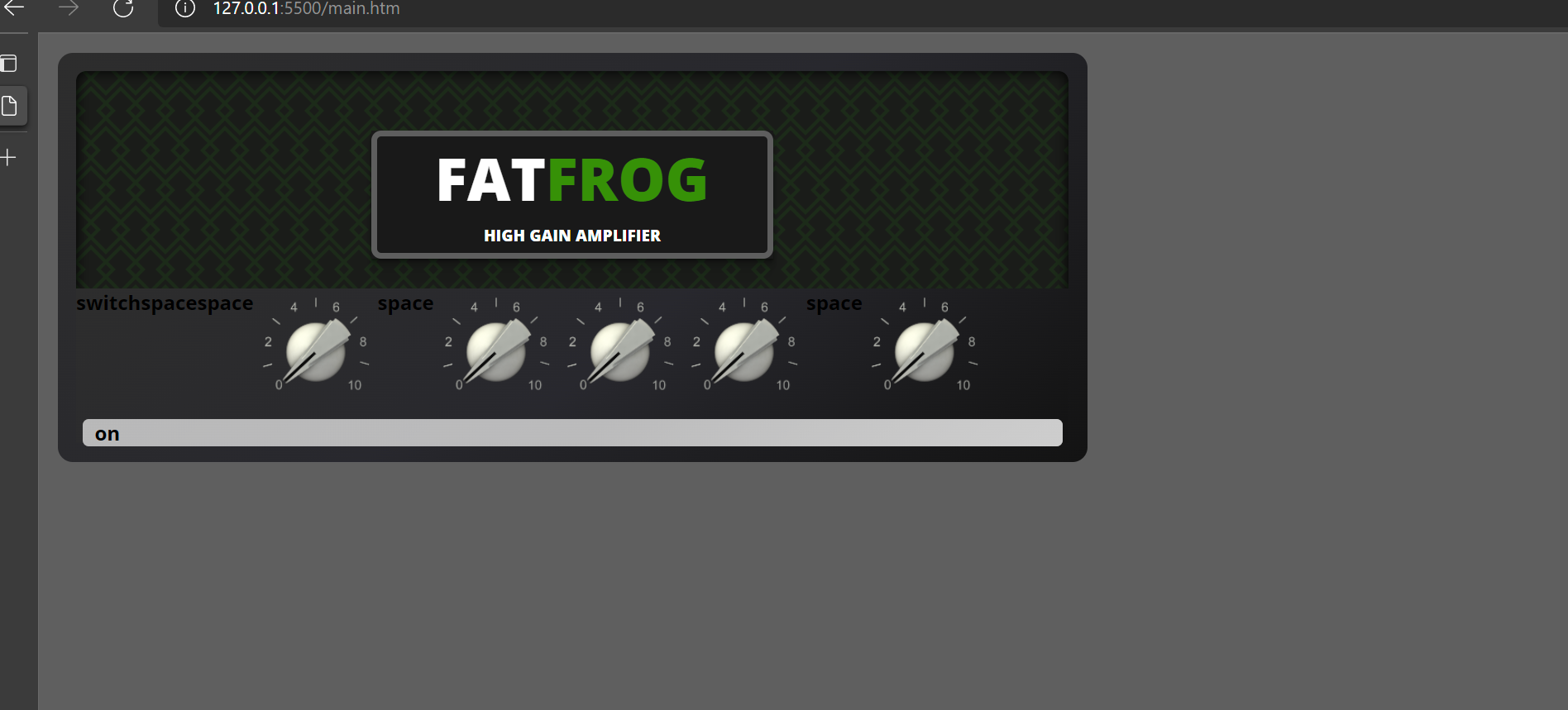
@brummer Wow! Looks cool! and it is tiny and nice! And I can recognize that you used my scale as well.
Just a question.
Why don’t you let the entire community through some kind of votation system decide this kind of things? I think that if you keep the conversation to 4, 5, 6 people its gonna loop forever.
A votation like “what style would you like to see in the MOD Dwarf plugins?” with some explanation of the issue and the possible variations and a box of “aditional comments” would be enough. Send through email and let the rest of the community choose this kind of things.
It would be a lot to coordinate I think
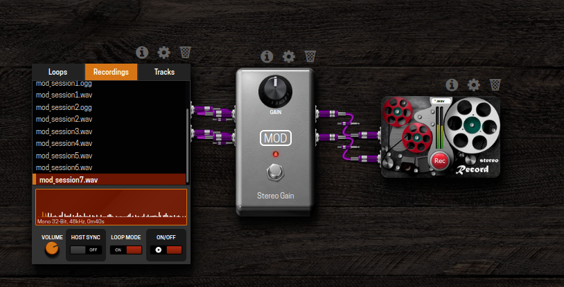
I was sure the webUI was not made for smarthones ? 
I think there is a part of the GUI that has been forgotten in this thread and which is really uniform on all plugins : the plugin parameter’s page
Could this part of the GUI be the start of a more united esthetic and the base for the smartphone Web interface for example ?
A few tweaks in color and the possibility for the developer to arrange the controls in categories… for example, do you recognize this plugin ?
___ off topic ___
I follow this fascinating thread from the start and doesn’t stop to change my mind with each respond !!! It is very beautiful to see a debate on the web with respect and good arguments on so much entrances, especially since here is a nearly 100% testosterone forum !
I hope you mean the format entry in the record plug and not the filenames in the audio-file-player. Otherwise, it may be time to get a new phone and glasses. 
But yes, I like to increase the font size for the extension field a bit before pushing it.
But, re: filename, there is no real advance in display the filename/s in the recorder, as, it is “just a recorder”, you can’t select files to play, as it doesn’t play files, it just record. Also, the filename isn’t known beforehand, it is generated as soon you press the record button, by scan the record folder for the next free number for "mod_session[x].extension
Yes, your scale image fit’s well, and the colours of the scale fit’s better then my old one.
I’ve scaled the background image down by 75% (in the css) to make it a bit thinner, and used the webp format images. That seems to me a great benefit moving to webp.
Correct, it was a fail in my description not my eyes or phone 
Oh I get you. Could it be possible to change the text “mod_session” from the plugin?
I think the progress here is great. For me this design still feels like it’s weighted more towards a flashy appearance and away from usability but it’s cool. It would be good to find a balance in the middle though
This is awesome to hear! This alone could bring some big improvements to load times and allows us to use higher resolution renders! Nice work to both of you
I’m happy to hear that. 
Well, yes, but that will be a feature request and is in no way related to the artwork. (requires me to rewrite parts of the plug and implement atom ports)
Okay, the next level to reduce the size, or increase the inform/control/-plug-size level will be to just display a “Big red Button”. Just as a side note, compare a simple gain control with the recorder plugs with there new interface:


Some polishing still is needed. The red lights are too big, the buttons are not yet in a precise position, writings too big, the feet are wrong etc.
Just adding more figma links
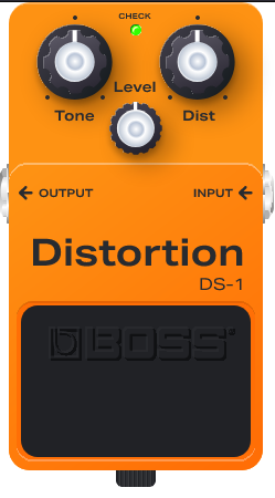
Tagged by boss there are other two interesting
I also found it:
I remove the textures and they yet appears great.
Without textures (did I hide them all?) vs with textures
I exported to svg and also appears good
(it’s a print of the firefox visualization of the svg).
Size is about 70.42k. “Applying” svgomg, is possible to reduce to 36.22k~53.82k (based on selected precision).
But the magical occurs if the tornado gzips the files.
The original 70.42k size will be transform into 15.71k, and the minified versions will be between 4.02k~10.49k.
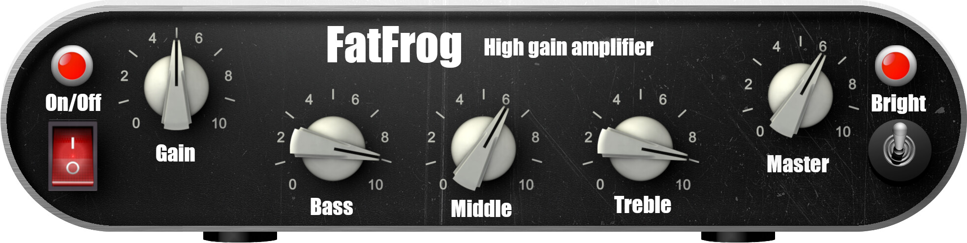
I was on to something but a busy schedule kept me from designing.(built upon my previous design but with a green, metal grille)
If @Kim 's design is more future proof and more your kind of thing, go for it though.
@Kim I like the compact, functional layout and I suppose it is a webp and/or vector?
About the font: is that Arial bold? I’m not a fan of the font, it looks “pasted on”; make it a bit too “Powerpointy” if you catch my drift 
Hi @LievenDV The font is “Impact condensed”. It is not ideal, I agree.
It is Webp. I am not the major 2d artist, I am a game developer. Thus, I am only thinking in vectors, but in three dimensions. To create 2d graphics you need experiences and you must know the tricks. I did it in former times but it is not my strongest skill… 3D is much easier for me and textures for 3d models are pixel-graphics. Thus, I am fit in generating pixels.
on a technical question: does it make sense to only use css and svg’s or do you need images for styling you plugins?
This is the CSS version of the design i suggested. This is just a quick write up during my lunchbreak but it uses only a svg for the background and @Kims knob images. Most of shadows and gradiant layers a still missing.
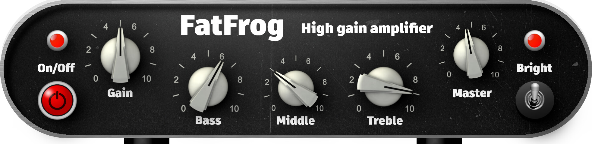
i guess a lot of this is personal taste… but if we’re heading in a skeumorphic direction anyways, i think @Kim nailed it with this one for Fat Frog. excellent balance of information density plus style, with very little “decoration-only” space. sure… tidy up the fonts and lights and such, but this one seems really high in both usability and visual appeal to me.
The catch here is that indeed everybody has his taste, so it’s difficult to make everyone agree.
That’s why IMHO a community open team should put more than a few guidelines to help and stimulate people contributing. What is needed is more a sort of “framework” to work with. A collection of graphical objects to choose from (knobs, sliders, buttons), fonts, templates, backgrounds… everything that a plugin developer should need to generate a gui good enough to work and integrate with the ecosystem without too much hassle. I know some find this approach bland and “not creative” but consistence in an interface is what makes the user productive and at ease.
In a perfect world you could have skinnable interfaces nad have the user choose between cool and graphic heavy plugins or simple and high contrast/easily readable plugins. For example, lease take note that there are also visually impaired musicians in the word, so colorful interfaces might not be the best choice for them. If (or as long as) you can only have one interface, logic mandates that you try to stick to a common ground.
Anyways, my point is that is already difficult enough to rely on talented people contributing good sounding plugins to the system. Expecting to have people contributing ALSO good looking plugins is requiring, like others alreay noted, too much, because we need competence in two field of expertise, or multiple people working together. And on top of that exposes us to the conflicting tastes of graphic artists.
So, the only sane strategy I see is that the Mod Team provides a sufficient framework of things to enable audio developers to generate a more than decent interface without knowing a lot on graphic stuff nad losing time. Ideally with a “compliler” tool that prototypes a decent interface by parsing the source files.
That said, I agree that the last FatFrog interface has finally a good ratio of useful space vs decoration.
We don’t need to use images, even plain css will be suite.
Well, it looks good, like it. But I’m here with @plutek, @Kim nailed it very well.
Very cool. Just one remark, or two, On the left and right side of the UI we need to implement the jacks, so there we need a straight area were we could dock the jacks. Otherwise it looks a bit strange.
The controller labels may be better done with css, that will make it all a bit more future proof, (maybe I add a more versatile EQ section as requested by @solobasssteve )
This looks really promising. If we could make some original designs similar to this that would be awesome!
I really like this one. It clearly is identifiable as an amp. My only request would be to cut down on the unused space. Like reduce the width to just fit the controls. Also could reduce the height so the kind of “grill” area is just tall enough to fit the branding
This is cool too. I agree with brummer about the straight edges. Maybe some smaller radius corners would be better. I think some cleaner looking buttons, switches and LEDs and font could help. The knobs you made look great here! I would say its slightly less recognisable as a guitar amp, it perhaps looks more like a hifi amp. I definitely can’t complain about the information density here it’s really good in that sense
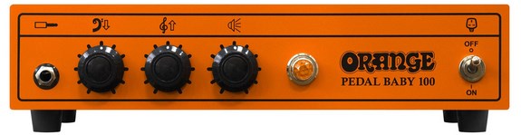
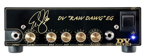
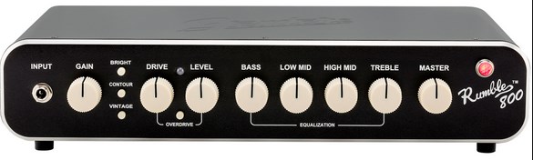
If you think about traditional sixties valve amps… may be… but there is another type of amp head available, like the Orange Pedalbaby, the DV Marks or the Fender Rumble. And my design is exactly of this type.
Funny, I’m just working on a Orange AD15 simulation