your rendition reminded me a little of the Trace Elliot ELF 
2 Likes
Shall I try to create an UI for the AD15? It could be near the Original… After my return from Karachi I could try this…
2 Likes
Oh, that would be nice, but it’s to early to promise any plug resulting from it for the MOD. I mean, I’ve running the simulation, but so far not tested it on the MOD. Only when it runs smooth and sounds nice even on the MOD, I’ll publish it. I’ll send you a message when works.
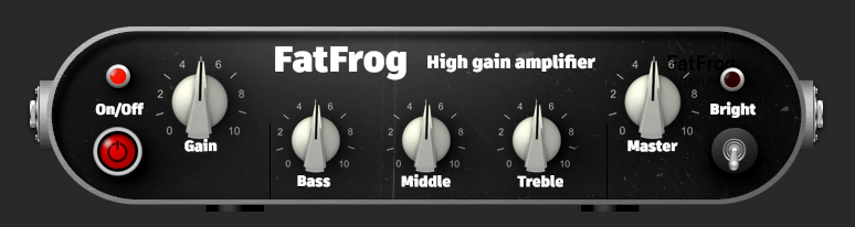
A small update on the FatFrog, here is a screenshot from the mod-sdk (all webp based):
8 Likes

You see now; didn’t we tell you to not to quit just there? 
7 Likes
Hi there
So, the first MOD UI’s resulting out of this thread, the ones by @Kim, makes it into the MOD store. Those been the new UI’s for the recorder plugins. When you update the recorders from the store you’ll get the new, shiny UI’s.
I would say thanks to all participate in this thread and help driving this into something usable. 
Enjoy your MOD
Forgot to mention, this is the very first plug using images for the UI in webp format, while that format is widely supported in all browsers, it should work anywhere. But if anyone experience a issue, please let us know.
13 Likes
I was just fiddling around with the beta recorder (mono). Great work @brummer and @Kim ! Looks great and it scratches an itch. I created a loop using Sooper Looper, then hit record and can export it for use in Qtractor! This will make the loop recording tools way more useful for creating “sketches” of song ideas. Love to see the collaboration
5 Likes
@malfunction54
Sorry for the late reply, but I’ve been abroad on business for over a week and still a week of travelling to come. Thanks for the compliment! But the credit belongs to brummer, not me. I have only contributed a small bit of design. The actual genius of the plugin was created by brummer.
2 Likes
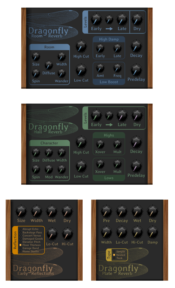
So I got the bug to play around in Inkscape, and decided to mock up a GUI for the Dragonfly reverb series - which isn’t even available in the beta store yet lol.
I just grabbed a random knob, so I’m not entirely happy with that, I think metal knobs might be better with this aesthetic but I’m not sure.
Also, the two smaller units - Early Reflections & Plate - I kind of fizzled out so didn’t take care of some of the minor details like shading the ‘paint’
With the exception of the knobs and the wood grain, this is all done with pure SVG.
Thoughts, criticisms?
11 Likes
Personally, I feel that it looks cool and I like the “Moog style” with the wood and so.
Not sure if this part on the knobs also makes you unhappy with them, but the little pointer for the value having the same color of the text feels a bit too much information and kind of boring. I would go for a slightly different color on one of them. Maybe keeping the text white and even leaving the graphics in the same color.
3 Likes
I kind of agree on the knobs. Different types for the big and small ones would be nice. Layout and graphics wise this looks great though!
4 Likes
I love the Moog look! Now I want to try out the plugin in question
3 Likes
Nice work @FistfulOfStars I kinda agree with the other guys. I’m not that into the knobs but I like all the stuff that you did. I find these knobs to be overly detailed. I think a much simpler one would be nice, just a circle with a line. If the knobs were also vectors that would be ideal. I do like the wood grain but I think even without that texture it would be a nice clean design and would be entirely SVG. The font looks a little bit old school to me but I don’t mind it. Really nice work on the graphic!
1 Like
Yeah I’ll definitely try some other knob styles.
I took that font, and the colors, from the official lv2’s, kind of a nod to the originals and the guy who created them. So for that reason, I think I’ll be keeping the font and colors as they are.
You can see the official GUI’s here:
5 Likes
So here’s my first attempt at custom knobs. Is this an improvement, or a step back?
Also, this version is 100% pure svg.
I’m having an issue where if I open the svg directly in Firefox, the text isn’t positioned correctly. I need to figure out why. Any graphics pros here with some advice on that? Do I need to convert the text to paths to fix this, and to avoid having to embed the font as a binary value?
At some point I’m going to have to bite the bullet and try to turn this into an actual MOD GUI… that’s the bit that I’m quite fearful of to be honest.

8 Likes
For me it is, to be honest, a step back. Why not using the buttons before and making the pointer in white colour?..
4 Likes
…and yes, you must convert the text to paths. If the text is text, the settings of the browser can rule.
4 Likes
I’d only change the notch color to the same color of the rings in the big knobs.
White on light gray is not very readable, expecially if you don’t zoom on the plugin.
4 Likes
I think this is almost a perfect example of how a vector based GUI should be! everything is nice and clean, easy to read and a great balance of aesthetics and information density!
Really nice work on the shadows and highlights considering it’s all vectors! you must have used a lot of gradients!
I think you completely nailed it 
Agreed. It’s always good to convert text to paths. We got a lot of device prototypes in the past where our laser engravings saying “MOD Duo” or “Expression Pedal” were engraved in Times New Roman or even Comic Sans! because the manufacturer’s machines were missing the fonts. It was very annoying but at the same time kind of hilarious
That’s probably a good idea. It would give it more contrast and make it easier to read. You could perhaps make the line on all the knobs slightly thicker too
5 Likes
It was requested that this design be pure svg, and also I agreed with a previous comment that it was “too detailed.” I had started out with it being that with a white pointer, and wasn’t really a fan of it myself.
What about it specifically is the issue? I’d love to incorporate some ideas to make it better. I was kind of leaning toward a metallic style knob, do you think a bit more detail in that direction would be beneficial, or no?
Your point about the white on grey is well taken. I’ll try the ring color, but I’m already concerned about it being too monochromatic. Will have to play around with it more.
I smell a new special edition release! 
6 Likes