I do think the black and blue look better than the silver
I tend to agree with this. These ones give a lot more info at a glance and I think they look nice
I do think the black and blue look better than the silver
I tend to agree with this. These ones give a lot more info at a glance and I think they look nice
I’d love to have the lightbars added to the knob position.
It’s such a useful amount of info at a quick glance.
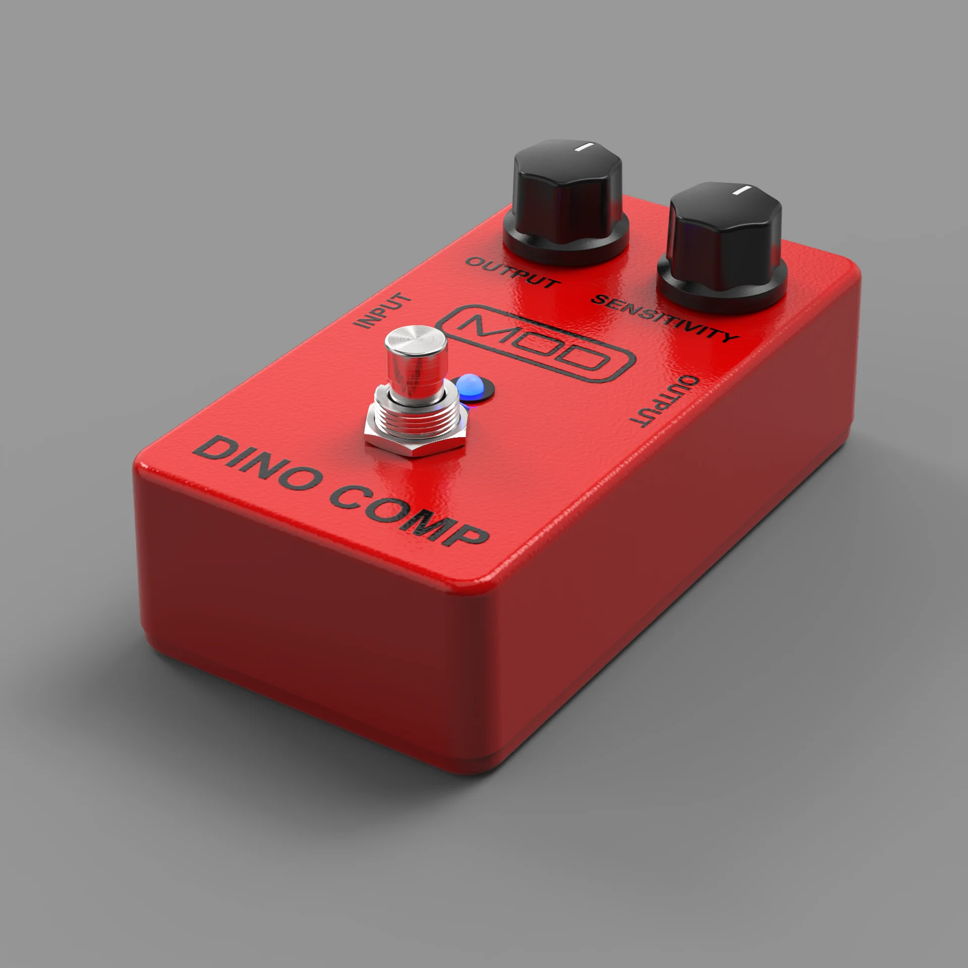
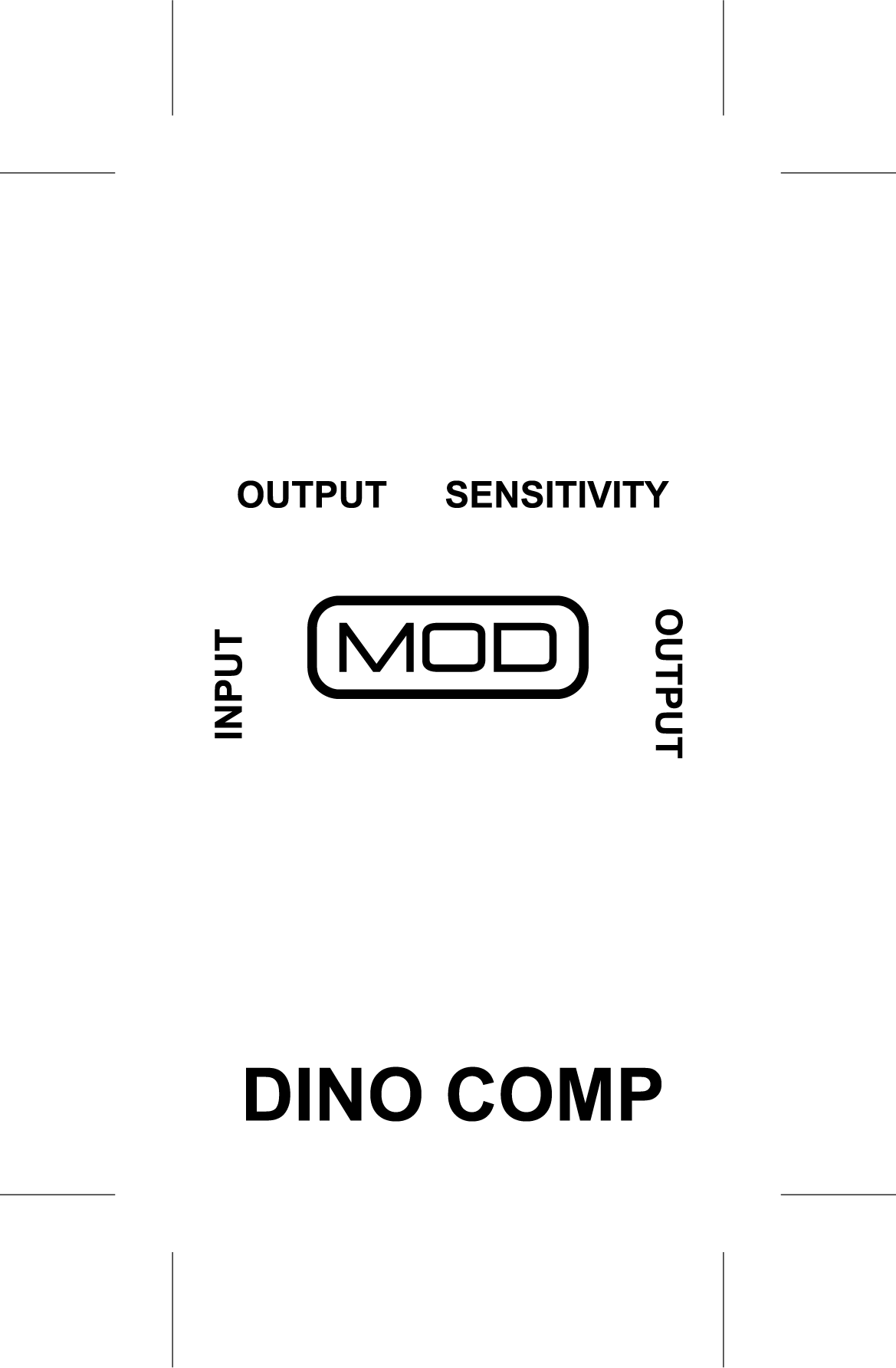
On another note, I did a little experiment over the weekend making a 3D model of an MXR style pedal to try some 3D renders. Here’s an example of a fictitious pedal
A low angle just to show the 3D model
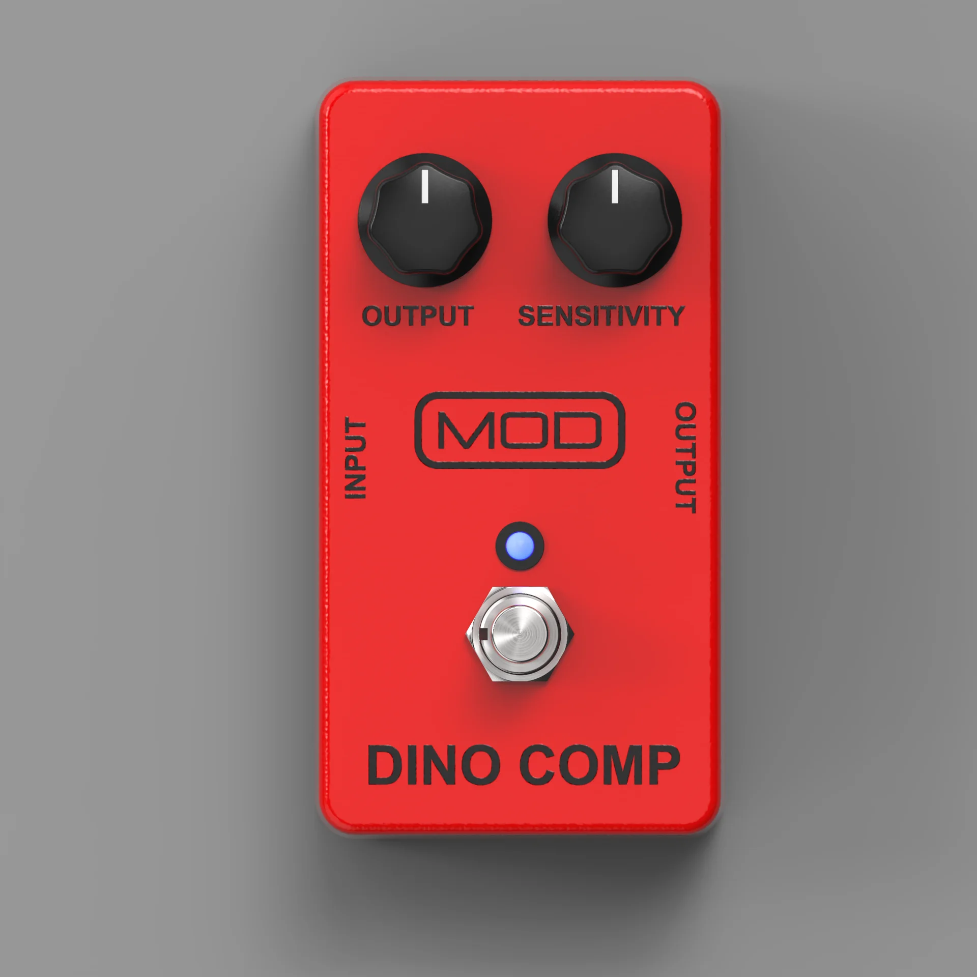
Top down orthographic view
I’ve said before I’m not a huge fan of this style of knob but I just wanted to see how it would compare to a real MXR “dyna comp”
I wanted to test out using an orthographic view (no perspective) as this would make things look a lot more consistent if all GUIs were straight on rather than some being on a slight angle. I think the footswitch and knobs are still pretty recognizable without the need for any perspective
This is just a test I did using some proprietary software. I would want to redo it using Inkscape for the graphics and Blender for the rendering so that the files would be more accessible for people to download and edit. Also I would render each element individually obviously. As in the enclosure on it’s own, as well as the individual knob sprites with all the rotated positions, Footswitch in up and down position and the LED in on and off states. All with accurately rendered drop shadows
I know I’m often talking about vector based GUIs which I still believe in most cases are a really great option but as I’ve said I think there is still a place for bitmap images if they are realistic enough to warrant the extra bytes  these images are 1920x1920 which is significantly higher res than most of our GUIs. They have been converted to .webp and are only up to 80kb so it is promising. Still I would also like to make vector based versions of these assets too which will look less realistic obviously but I think it can also look good
I agree - I actually prefer that style.
I thought however that somewhere in this 280 comment discussion I it was mentioned that ‘semi-skeuomorphism’ is on-brand for the MOD styling. Maybe I’m misremembering, it’s entirely possible. There are a lot of conflicting opinions, as to be expected.
I think that style is easier to read, and frankly easier and faster to create as well.
So can I be so bold as to ask for a bit more clear consensus as to what direction MOD as a whole wants to go?
I know ultimately it’s up to the developer, but at the same time having some guidance at least to official MOD plugins would be helpful for me when I’m trying to build GUIs that the community as a whole can appreciate.
@James, that render does look great BTW. Though your last two comments leave me quite confused as to which direction to go.
I’m probably over-thinking it and trying to appease too many opinions - both of those are habits that I have.
Actually I would say that’s what we spefically want to avoid in the sense of styling and textures. Semi skeumorphism was a comment about scaling things in a way that there is less unused space. For example, having less empty grill area on an amp. In terms of textures though I think it is best to go either of 2 directions, either a nice flat, 2D vector design that is easy to read, OR, a photorealistic (as much as possible) 3D render
This is why I think the flat style is so valuable!
Sorry to confuse, this was just an experiment to try an orthographic view on a 3D render. This style would be intended to fit the photorealistic route. I would still make some adjustments to make the final GUI “semi skeumorphic” by perhaps reducing the overall height (making the scale different to the real world device) so there is less empty space
To sumarise:
Choose either to go with the flat 2D vector style with .svg files OR photorealistic 3D renders saved as .webp
Adjust scales and proportions to reduce unused space and make it easier to view information and interact with controls
I don’t want to say everything needs to be flat 2D or everything needs to be photorealistic 3D. There is value for both styles depending on the plugin. I just want to reduce the in between with weird kinda realistic textures and shading and angled perspectives and plugins that have a mix of styles and perspectives
This is my style! I love it! May be a bit more of scratches and dirt…
I thought you would like this
Let me spend a bit of time this morning to make a diagram to illustrate the desired direction from my perspective
Did you model it in Blender?
No it was modelled in parametrically in CAD and then rendered in another 3D rendering software. I would like to move to blender in the future though so that we can share files with the community
Did you use PBR-settings for the material or multi-chanel-maps with normal-maps etc.?
The latter. In this case the graphic on the top is an image which is adding the diffuse map for the black colour as well as a displacement map so that it is slightly raised as if it’s an extra layer of paint that has some thickness
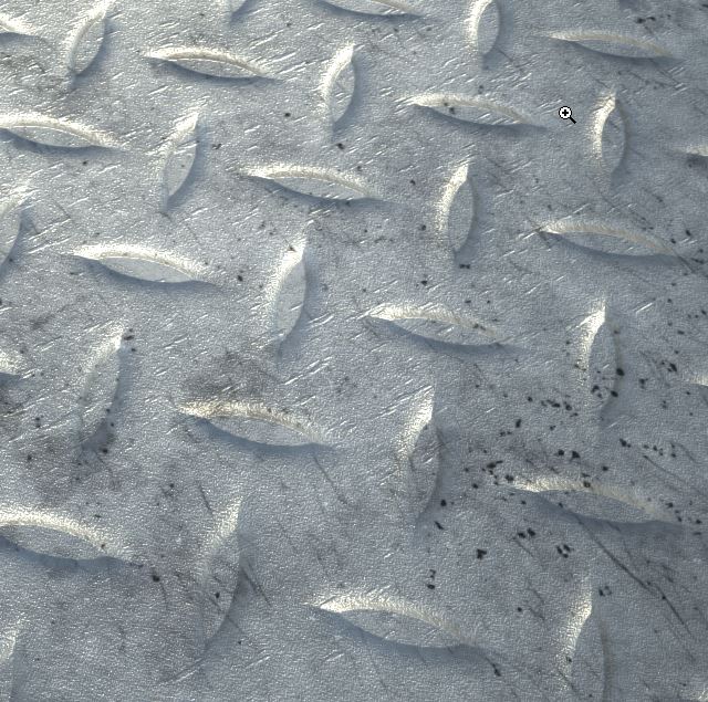
Recomendation from my side: Use the PBR settings. These are much more powerfull and even more realistic, especially for dirt and scratches. The settings are for metalness, refelction, ambient occlusion etc. Or use the substance painter.
This is an example, just taken from internet:
Sorry that’s not entirely true what I said. The material is PBR but it also has multichannel maps. The 2 aren’t mutually exclusive. So you have an “advanced” PBR material with channels for diffuse, specular, roughness, bump, opacity and displacement
Here’s a bit of a guideline as to what I believe would be a good direction to go down. Nothing is official yet, this is still a discussion and we are learning together as we go.
I know that this goes against our current SDK. I think we need to update the SDK and create new asset packages but that is a big project that we can’t take on right now. So I would encourage you guys to keep making your own stuff and avoid the SDK if you have the time to make everything custom
Consider this a nudge in direction
With the “semi-skeumorphic” designs I put on there, I probably went a bit too far with the vertical squeeze  it doesn’t have to be that extreme
beautifully clear guide, @James! i like the two-direction approach.
…had to look up “uncanny valley”; the concept is an interesting commentary on a number of trends in both product design and cultural content.
Well, I must admit that I mostly like the old style (MOD DS 1) from all forms you provide here which you mark as no go. The Dine Comp you provide as nice has a big issue at the corners from the pedal. Only acceptable format other than that will be the one for the Compressor. But, that one could be done better.
I’m glad to see this topic didn’t die. Despite some of my previous communication, I’m wishing the MOD platform well and really hope it succeeds.
@James What you posted above looks very cool, some of the @Kim’s designs were pretty cool as well, but it seems to me (based not on my own preferences - since I’m not a MOD user anymore - but on some of the most recent comments) that the barrier to entry is simply too high for most users when it comes to creating graphics using 3d tools. I’d probably need dozens if not hundreds of hours of training to try to create something similar (even then, I doubt I could), but I could probably make a few of the “semi-skeuomorphic” stompboxes (the examples of which you posted above) in one evening with a cup of coffee. And I’m not a graphic designer.
Everyone has different preferences, and beautiful UI can certainly inspire creativity, but at the end of the day it’s about the sound coming out of the box, and the more time we spend with a piece of gear/software, the more important efficiency becomes. I’ve already posted examples of what modern multi-fx units usually look like, and shared my views on the importance of readable UI/market trends. Let me supplement that with an anecdote. I’ve recently tested Tone King and Benson plugins from NeuralDSP and Mixvave respectively. The first hour with both of them was great. They look just like “the real thing” and the fact that they sound great doesn’t hurt matters either. That being said, despite liking both pieces of software, I declined to purchase either of them, partially because the UI in my HX Edit is so much faster and easier to work with.
@James I don’t know if a system-wide UI overhaul is something that you’re planning to do and how important that even is to the platform as a whole. It’s not like the current MOD UI is terrible - it certainly isn’t. I’m sure it even attracted many of the current users. What I do believe though, is that MOD should likely aim to make it as easy as possible for the community devs to create quality software for the platform. LV2 is already niche, LV2 plugins ported to MOD will always be an even smaller subset of an already small plugin pool. I suspect that a realistic/skeuomorphic approach to UI is a barrier to entry, (which some of the above comments seem to echo) and I’d imagine that the fewer of those barriers are there, the better it will be for the platform.
Again, I’m not a MOD user anymore, and I’ve been a bit of a dick in the past at times (sorry about that) so this is just meant as an observation and not a ruling “on how things should be done”. I’m making it mostly because users voiced similar views above, but those voices were not quite as loud as some of the others, despite having a lot of merit to them.
EDIT:
One more thing. Ableton became extremely popular among musicians in recent years. It’s not my main DAW but I got the 16-track license for it anyway, just because of how fast you can create an idea inside of it when compared to other DAWs. My immediate thought when I saw this semi-skeuomorphic square stompbox with light bars, that’s right next to the Ableton compressor in the image posted above, was: “this feels right”. Just a thought.
What is it about this one that you like more?
Can you elaborate on what the problem in the corners is?
I completely agree, which is why I have been putting so much emphasis on vector based designs. They are much faster and easier to make with free software that doesn’t take too long to learn. Plus we can easily share working files. There are a lot of people willing to contribute but so far we have only seen one person here try something with a 3D model. Its a good indicator that vector base / flat designs will make things easier for devs. Flat designs are also very easy to use which is why after decades of research in UI/UX design, the vast majority of modern DAWs and Plugins use this style as you said
As for the 3D route, the aim would be to create assets and implement them into the SDK so a user can simply choose the enclosure, the colour, the knobs, controls, titles and upload images that would be a kind of colour layer, so the highlights and shadows of the render are automatically applied to it without ever having to touch the 3D software. This, of course, will need some time
It’s been on the cards for a while very important!
You are completely right. We have a lot of work to do still on that front
I get that feeling a bit too. This discussion has been going of a lot of assumptions until now which I think is okay because we are just spitballing ideas. I think that soon we should start to do some polling/surveying of users to find out what they value most in the plugin GUI designs
This is very helpful, thank you.
I do take issue on one point though, I am very much not a fan of the 100% flat vectors like your examples. It seems that you’re wanting vector designs to be completely void of shading or gradients. I think that when used correctly it significantly improves clarity and ‘perception of value’ to use your phrase.
As an example: In the illustration below, I strongly prefer the model on the left - it’s not trying to look ‘real’ but just add definition and clarity.
Do you think this is a step in the wrong direction, or is your point simply that if you are trying to model a ‘real world’ physical component that it be done via rasters?

Edit: And just because I got bored lol:

To be clear, there’s no good reason to try to emulate this style knob via vector graphics. I was just having fun.