I mean the left side of the pedal, the corner looks damaged to me.
I like the texture and the rounded corners.
I mean the left side of the pedal, the corner looks damaged to me.
I like the texture and the rounded corners.
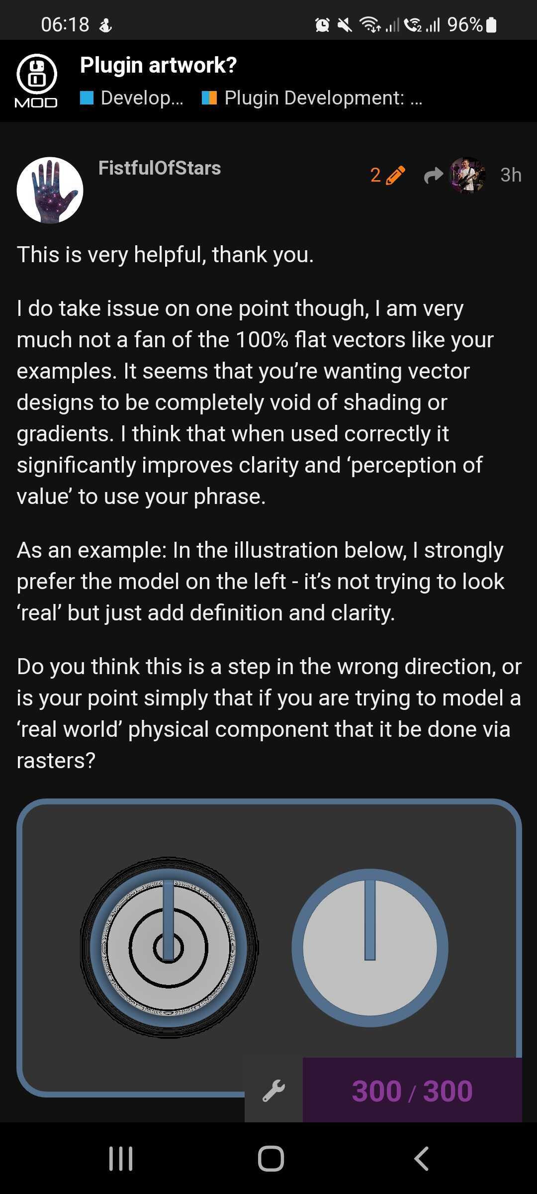
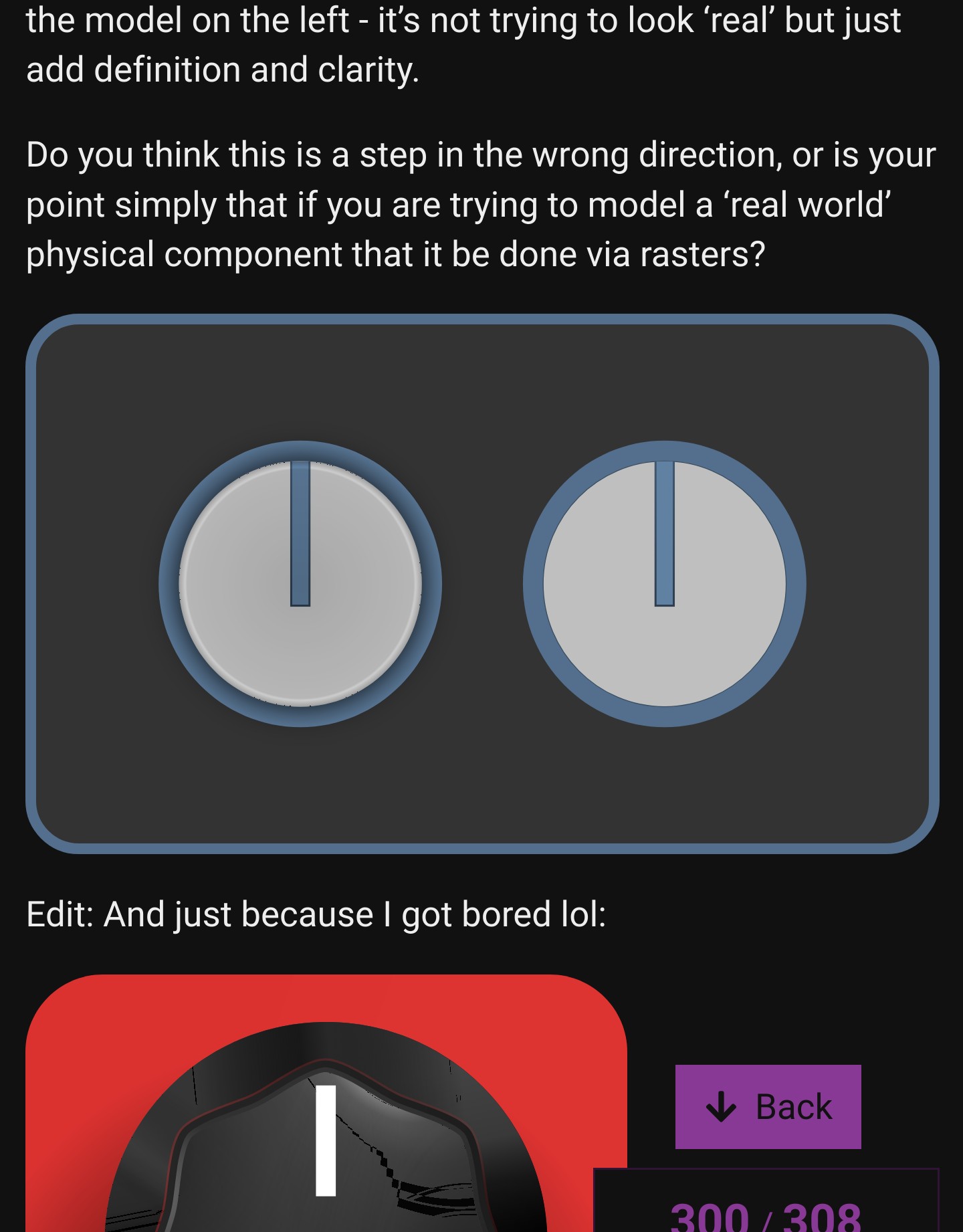
You’re right in some cases but it’s a slippery slope I think. It’s very easy for it to fall into the uncanny valley if you’re not careful. That’s why I did more of a “caution” sign rather than a tick or a cross because it can go either way. If it’s done in a subtle consistent way without too much detail I think it works. Here are some examples of where I think it works
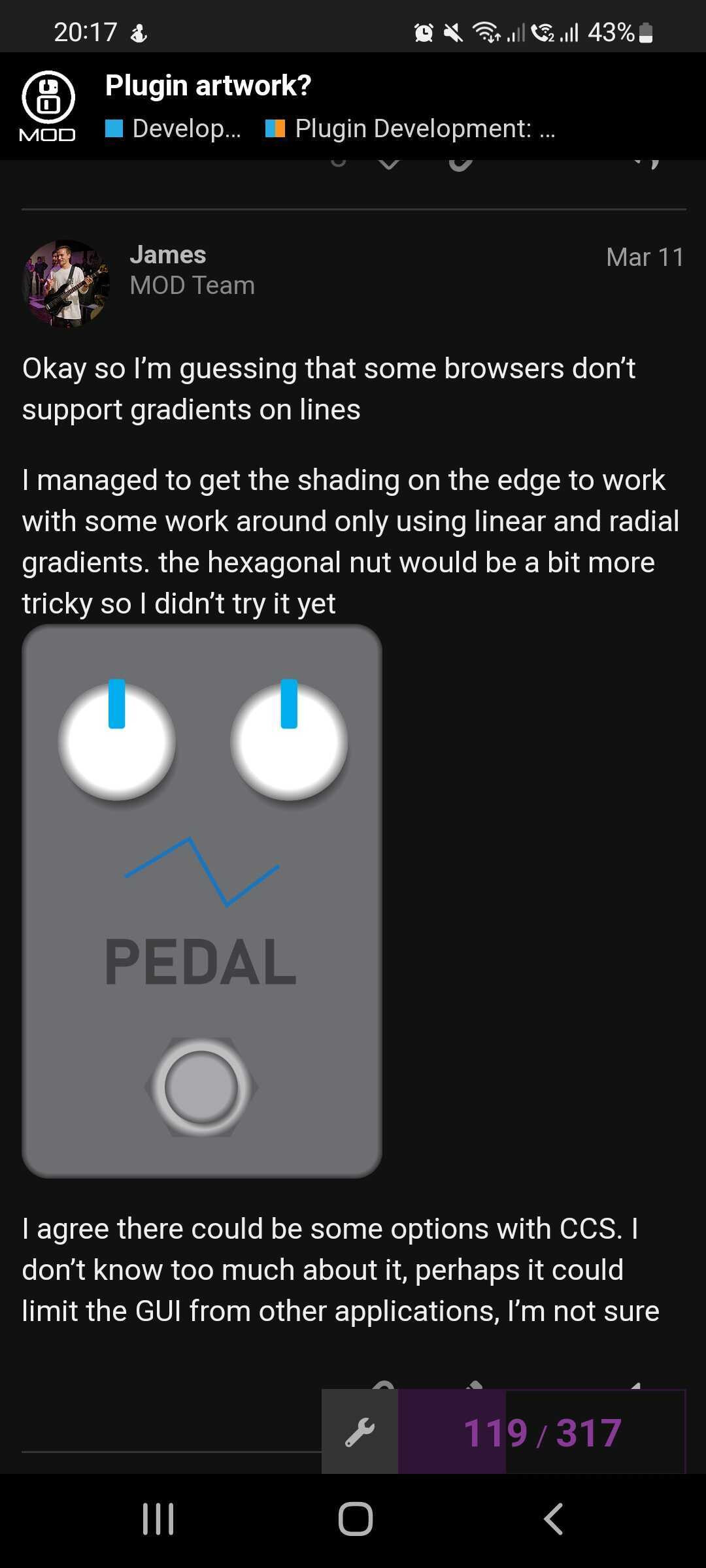
No, I think this is pretty safe. I personally would remove the thin border around the indicator line. I don’t think that amount of detail is needed. This is a pretty clean design though. I will just point out that it looks quite strange on my phone
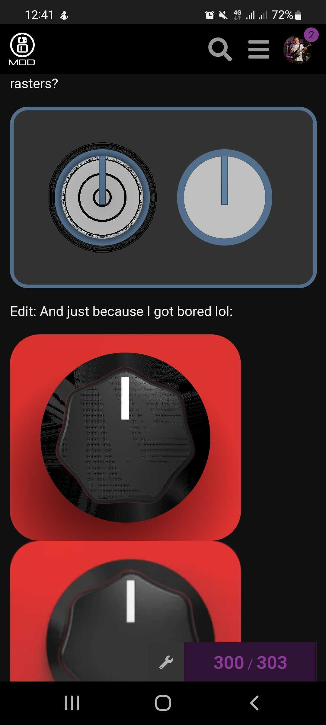
Woah! the one on the left is a vector graphic? if so I’m very impressed. How did you do the highlights and shading with such specific shapes? I can see a value in making elements like this
Do you mean on the very edge where it’s pixelated? it might just be the way I cut it out on photoshop. Or do you mean the geometry or lighting on the curve of the corner?
I can understand that subjectively you have a preference but in terms of realism we can objectively say that it is less realistic as the textures and lighting are not PBR and the corner geometry does not match the real world device
That’s concerning. I don’t see that on my phone. Granted, that export was done quickly without any optimization or QC, but it’s a stark reminder that SVG is subject to different browsers interpretation for rendering.
What phone/browser combo are you using?
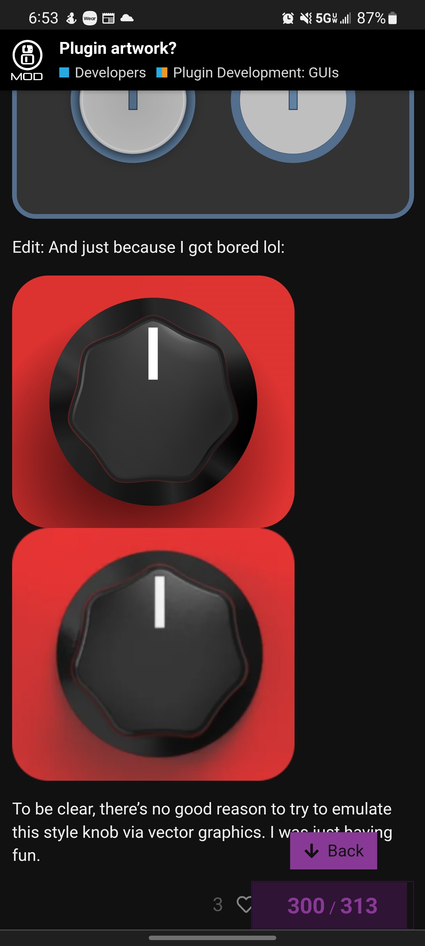
It’s kind of ridiculous honestly - 12+ layers of gradients with varying opacity and blend modes. This particular example was rushed, and would not look right when animated - but if I took more time that could be corrected.
It’s not as bad on the second knob you made
That’s impressive! Hmm something I found with SVGs is that browsers don’t support all types of gradients and blend modes that are available in the software. Linear gradients and circular gradients work fine but path driven gradients don’t seem to work
Those really look terrible.
I’ve tested on my PC with Firefox and chromium, and on my Motorola with chrome and brave, and they all look like they should.
No path gradients have been used.
It’s quite concerning that rendering can be that different.
Is anyone else seeing these types of rendering errors?
Nobelprize material.
I love where this thread is going.

@FistfulOfStars i’m seeing artifacts on my Android tablet and phone - not as bad as what @James is seeing, but still definitely not clean. i’m using google chrome.
…i just checked also in firefox on my android devices… whereas in chrome the 3D one was not too bad, in firefox the flat one is clean, but the 3D one is worse than in chrome.
Same! I am hoping something solid comes out of this 
The knob at the bottom seems to be rendering in a strange way
In which way ?
Here is on Kubuntu witch chromium, I don’t see any difference with firefox on android :
On this screenshot, you can see tearing on the image at the bottom
that “tearing” on the bottom knob is what i see with firefox on android as well.
Well, I’m all in favor of the flat + functional approach.
100% behind the flat and clean aesthetic.
If we get the ability to have local theming on our boards, I’d choose flat style every time.
At this point I’m giving up on the use of svg for anything beyond completely flat designs. The variance is too wild and unpredictable.
On a Samsung tablet I have the white knob shows as dark grey. Same device on chrome looks fine.
It’s obvious to me that transparency is the problem, but same browser different device, and vice versa, have wildly different results.
Can any graphics professionals confirm whether I am doing something wrong, or is this just inherent with SVG browser rendering?
Looks like it’s time for me to start learning blender again
It seems to be only problematic in certain circumstances
This one that I made a while back seems to render fine on my phone
Just a guess, but perhaps the problem is when there are 2 or more transparent objects overlapping each other?
It might be something to do with embedded SVGs (like those in an <img> tag) can behave differently to in-line SVGs. IIRC in-line being the more compatible.
Although “harder”, you could combine some of these techniques with CSS for styles, shadows and gradients. These could behave more predictably and could be easier to design to fail gracefully.