Perhaps the ability for CSS overrides (global) would be a nice starting point?
that’s what drew my to the platform in the first place. That in theory I can develop (pay someone) my own plugin and have them on a standalone device. Not that I’m even close to doing that but that option is a huge plus.
than most of new designs will be in the hands of the MOD Team. That is good to know.
this looks really awesome. Is it possible to separate the layers (lighting, reflections, color) so that you don’t have to render ever different color or is it easier just to render them all?
this also looks totally rad. Maybe if you have the capacity I would really liked the design of the FatFrog I did be rendered as a real amp and have a comparison to the vector approach.
+100 for that.
CSS was mentioned…
I’ve got experience with CSS from a previous job experience and freelancing in webdevelopment.
Curious how far we could take that route.
If that would mean we could still use pixel files as well but make them responsive etc, we could still have designs that would be very complex to achieve on vector only BUT in a scaleable fashion.
when it comes to the “flat” and “simplified” designs:
A flat design is odd because you take a step away from the realism but you DO keep the physical restraint of what size it should have? It’s the “compromise” but in the wrong area if you ask me.
The Helix (and alike)flow stuff; the answer is easy. they have to make it work on a relatively small display on your pedal board and you must be able to work with it on stage as well. Sizes need to be ultra-formilzed to make sure it uses its limited on screen real estate to a maximum.
I wouldn’t mind “strongly suggesting” a limited set of standard sizes so it helps user identify pedals, amps and what not based on size. It could have an optional align to grid, which would be extra beneficial for synth stuff.
Rack view?
The front/back/rack view discussion is interesting. I loathe a view that takes away the overview of the “flow” by cramming them i na rack with wires going everytwhere but getting your controls together makes your GUI more of a “control dashboard”.
Being able to have several views of the same board would be a powerful combo, serving different audiences and applications. it’s a b*tch to maintain though.
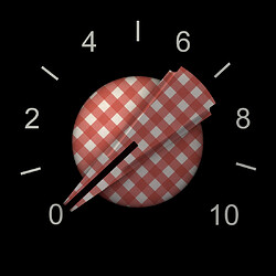
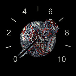
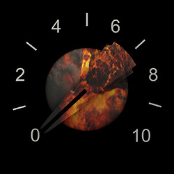
@Kim the render of that chicken head knob looks good!
I might not be your biggest fan when it comes to pedal/amp design but if you can render components like this your designs could end up in nearly ALL plugins out there!
That would be cool. I would also be able to have a crack at it but don’t have the time currently.
Not sure what the right term is but I was thinking the user could just upload their own background image from the settings menu. There is a strong reason to not allow custom background images though because of pedalboard sharing, screenshots, videos etc
This should be posible and would be pretty useful
I’d love to see that too
I’d be interested to know your ideas on how this could work
I don’t see it as a compromise. Generally the reason for making a GUI simplified is focus on delivering relevent visual information in an efficient way. Also the size of the plugin is a constraint but stepping away from skeumorphic design can allow you to fit more information in a given space without looking cluttered.
That’s true but we can also benefit from using screen real estate to a maximum, especially on mobile devices.
Alignment to a grid would be a really nice option indeed! We have been trying to figure out how we could make that work with cable routing
It’s a bitch to maintain indeed. But perhaps we can rework the cables in a way that makes things a bit cleaner but this and the last comment are discussions for another thread
If MOD goes down the simplified look, it might mitigate the requirement for different kinds of “views” .
I’m not sure either, CSS was mentioned here but I have no idea what it would imply 
I imagine it as containers on a website. If you can make them scale fluently an you can give them responsive properties, I can imagine you can have both gradients and graphics with focal points etc all together. Turning these thingsi nto parameters, could offer more flexibility to the user (fixed sizes, somewhat resizeable items etc)
If MOD goes down the simplified look, it might mitigate the requirement for different kinds of “views” .
I think these are 2 different things. Making non-skeuomorphic GUIs (which can be using vector graphics) is about displaying controls and information efficiently and directed at on screen use.
For example, a skeumorphic graphic EQ can look like this, which looks like they do in the real world
Or it can look like this, were it doesn’t look like the real world but it is argueable more useful
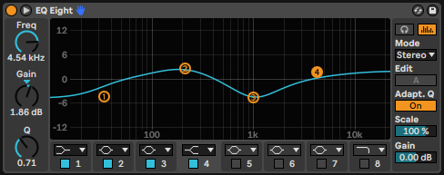
It’s not simplified in it’s controls, in fact it has a lot more going on. It is simplified in it’s aesthetic, as in it uses flat colours and basic shapes. It fits a lot more information and controls in a small space though.
The “simple view” would be a different thing, where plugins are displayed like nodes without controls at all. It would just be for routing and stuff or even would be a way to display full routings on a small display the way it is used on the Helix etc
If you can make them scale fluently an you can give them responsive properties, I can imagine you can have both gradients and graphics with focal points etc all together. Turning these thingsi nto parameters, could offer more flexibility to the user (fixed sizes, somewhat resizeable items etc)
I see what you mean. I think the problem is the file size of bitmaps. The scaling is less about customisability for users and more about, how does this image display when it is bigger or smaller on the screen (zooming etc). So we don’t want users to be able to adjust the size of things, we just want images that render well at all zoom levels without needing to be high resolution pixel images that take longer to load
Another advantage of the CSS approach is that the CSS can be swapped out for different contexts. for example, a mobile stylesheet might have simplified controls to fit the screen better as opposed to the normal desktop browser display. Though, as you point out, the trend these days is toward responsive layouts.
The Helix (and alike)flow stuff; the answer is easy. they have to make it work on a relatively small display on your pedal board and you must be able to work with it on stage as well. Sizes need to be ultra-formilzed to make sure it uses its limited on screen real estate to a maximum.
The desktop software (HX edit), available in high res looks almost exactly the same as what’s on the device. It’s not a compromise, it’s about making the UI readable and aesthetically cohesive with the added benefit of being easier to create (though not necessarily easier to design, that’s where guidelines would come in).
I like everything about your post.
The more i think about it, the more I’m convinced that different views are the best way to put the MOD system to it’s maximum potential.
The “information” underneath is always the same, the trick is presenting to the user a view to only the relevant part of the data for a given task.
The “rack view” is perfect when you don’t want to recable your plugins, but only neet to tweak volumes, reverber times and generally turn knobs.
The “constructor view” as it is is good when you want to add and connect plugins. In case we could have a rack view, I personally think that it should emphasize all stuff regarding connections, for example, a double click or right click on a knob should let us access a popup menu to see/set midi or CV connection for the knob, instead of having to go every time to go to the plugin option popup.
The “simple view”, where you ditch all graphics except for the in/out jacks, could work great for bluetooth/wifi connected control devices.
Let’s not forget that according to all accounts, using the current Web UI with bluetooth is already so heavy that the devs had to develop a dedicated entry point to try to mitigate the problem…
@brummer @James
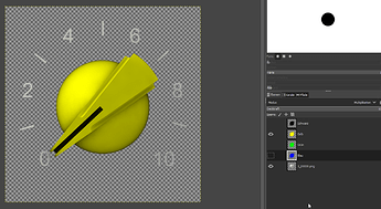
Here are the renders of the white chickenhead knob, 7:00 to 17:00 o’ clock, 64 stages.
It looks like you rendered the rotation as an animation with motion ease at the beginning and the end? Perhaps you can change the motion to linear so it doesn’t ramp up and down at the beginning and the end
Oh sh… you are right! You can easily feel that we are trained in copying the real life. And in reality this ramping is fine, but not for our purposes. Sorry for that. I will re-render it.
this looks really awesome. Is it possible to separate the layers (lighting, reflections, color) so that you don’t have to render ever different color or is it easier just to render them all?
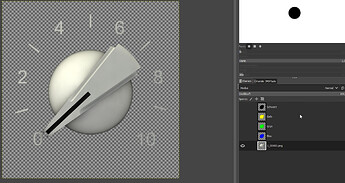
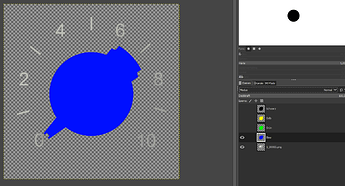
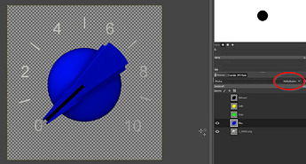
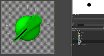
Normally this is done in Gimp (or Photoshop) not in a modelling-application. It has reasons that I’v chosen the white colour. You can turn it in all colours imaginable.
Load the image with white knob
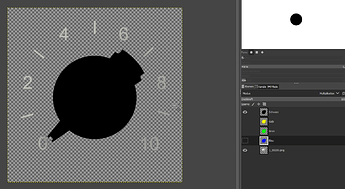
Create a layer with blue in the shape of the knob put it on top of the image with the white button
Switch the Mode of the blue layer to “Multiplication”
This works with all colours
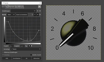
Instead of black. This must be rendered exeptionally. 
I found even a trick to make it somehow black. The highlight is still in the wrong slightly yellow colour but I guess it could be tweaked (no time for testing now.)
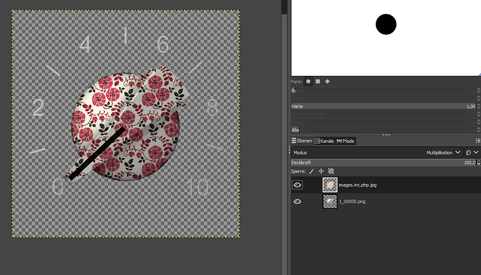
Even with flowers is possible 


Italian Knob
Hippie style
Gamer’s edition
except the Gate Button, that is a bit out of angle regarding the rest of the UI.
@brummer Where did you take this Gate-button from? Can you provide it? I can tweak it to the right angle, if you want me to.
Where did you take this Gate-button from? Can you provide it? I can tweak it to the right angle, if you want me to.
Yea. I take it from here: https://www.g200kg.com/en/webknobman/gallery.php
It’s the 808_tune.knob, For gate closed I’ve just recoloured it in webknobman.
But, it didn’t need to be this one, but one which comes close to the original used in the Horizon Devices Precision Drive.
btw. Your Chicken Heads comes really nice, I like the Hippie style a lot.
@brummer
Gate Knob Collision Drive, like the original, transparent, glowing blue when switched on
Gate Knob Collision Drive, 101 stages, gate off can be downloaded here.
Gate Knob Collision Drive, 101 stages, gate on can be downloaded here.
There is a small issue with this knob, when used on the dark background of the CollisionDrive, the upper left side has a hairy outbreak which looks a bit strange:

@brummer ah, ok. This is the disadvantage that I could not test it. It is refinable. Just a moment. But the rest is fine? Is it in both stages or only in the switched on?
@brummer This is the visible edge of the hole in the housing where the button is located. If it bothers you, I can remove it
Nice! Thanks a lot. 

